PunchAlert Website
Tools Used


Services Provided
Web Design, User Experience Design, WordPress, CSS
Client
Punch Technologies
Year
2016-2019
About
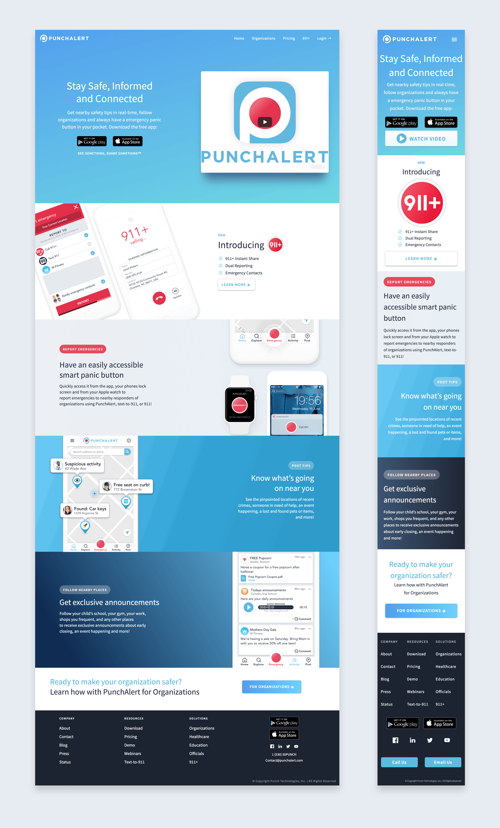
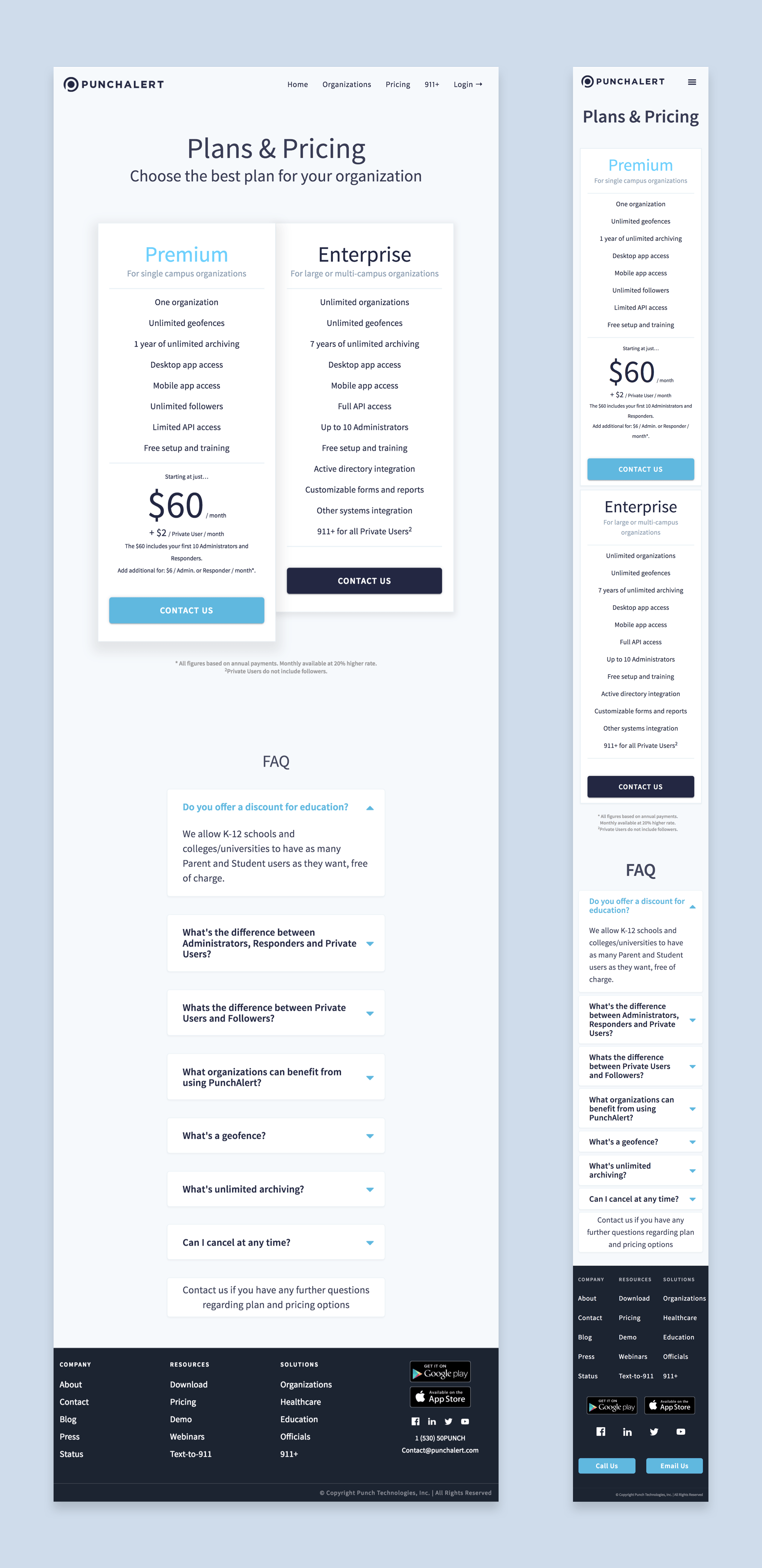
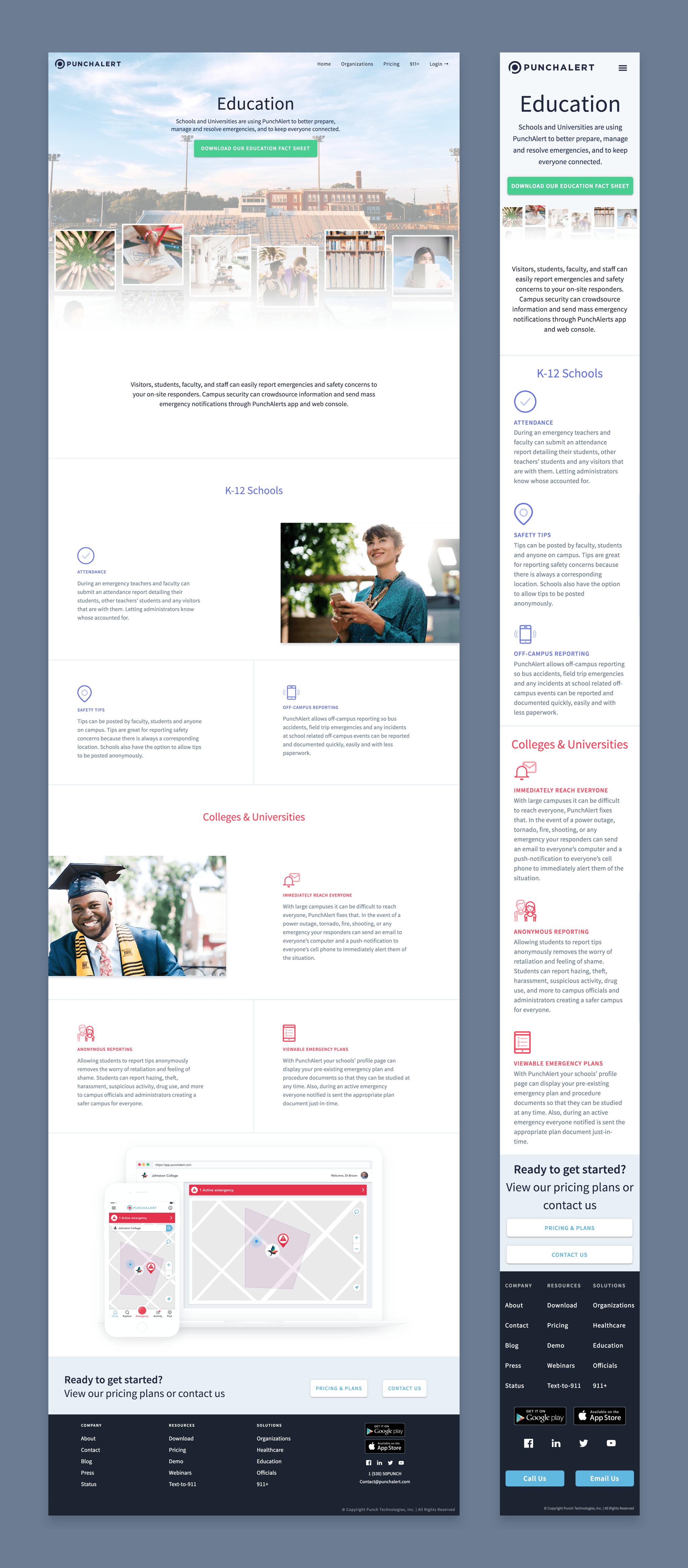
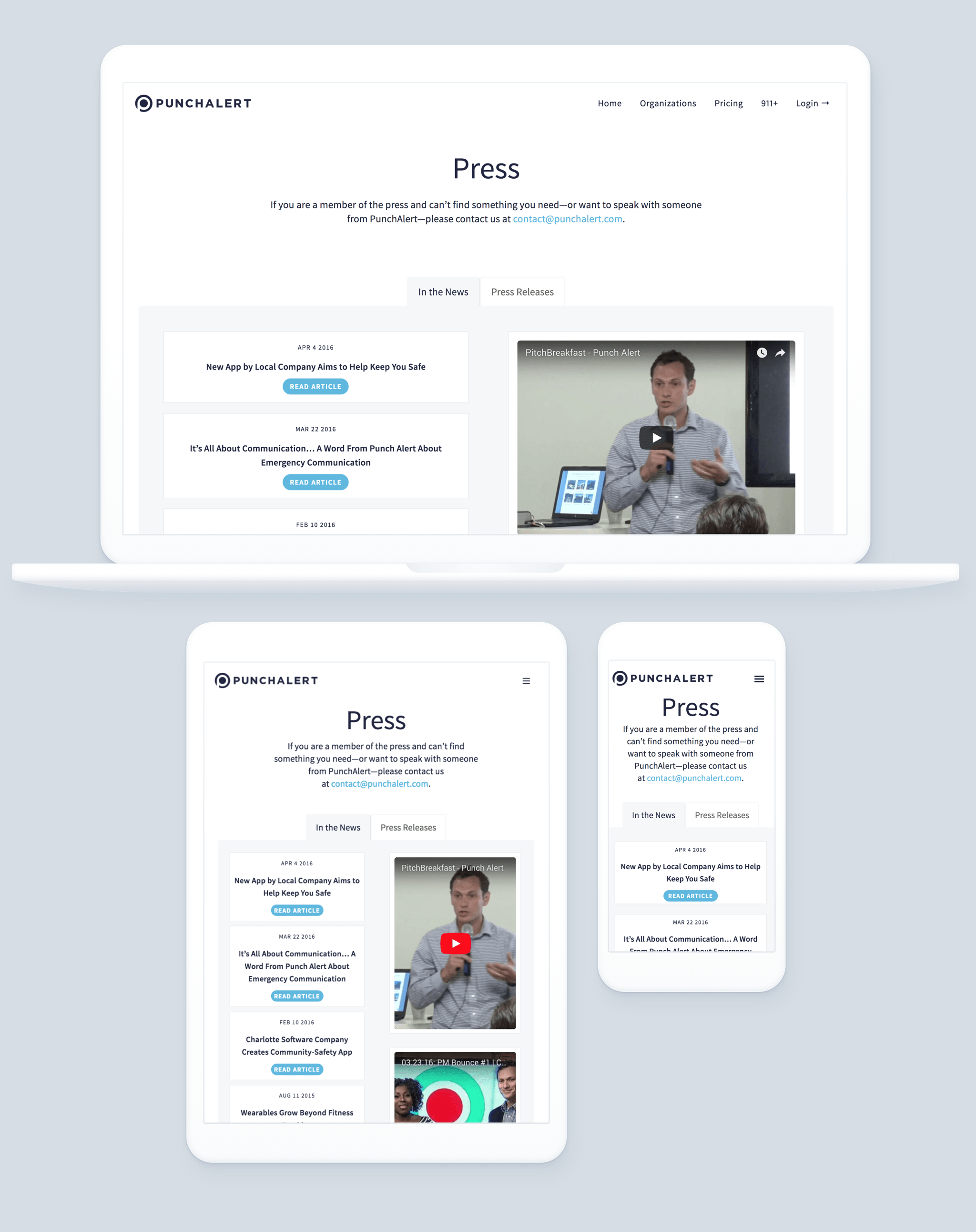
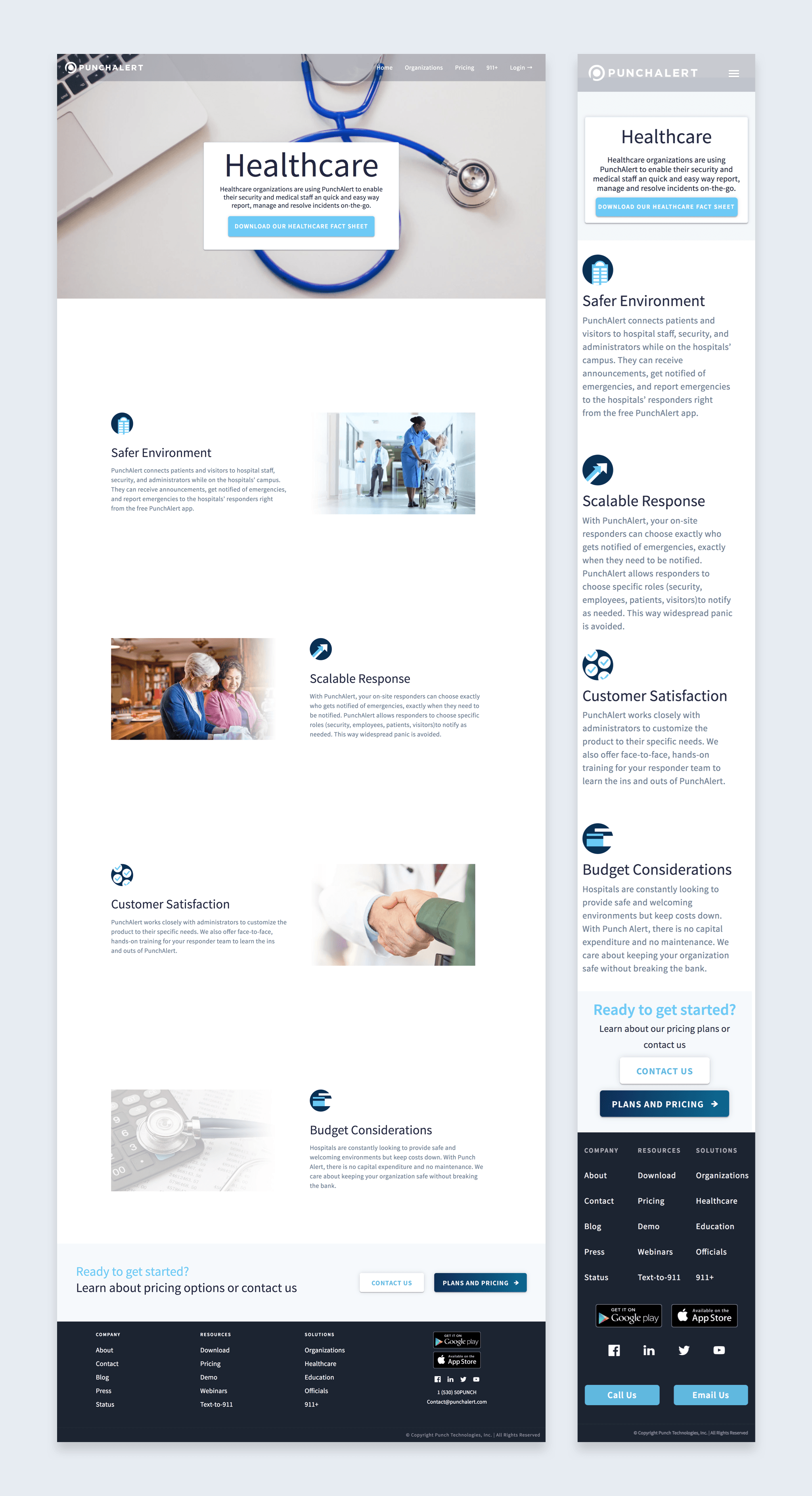
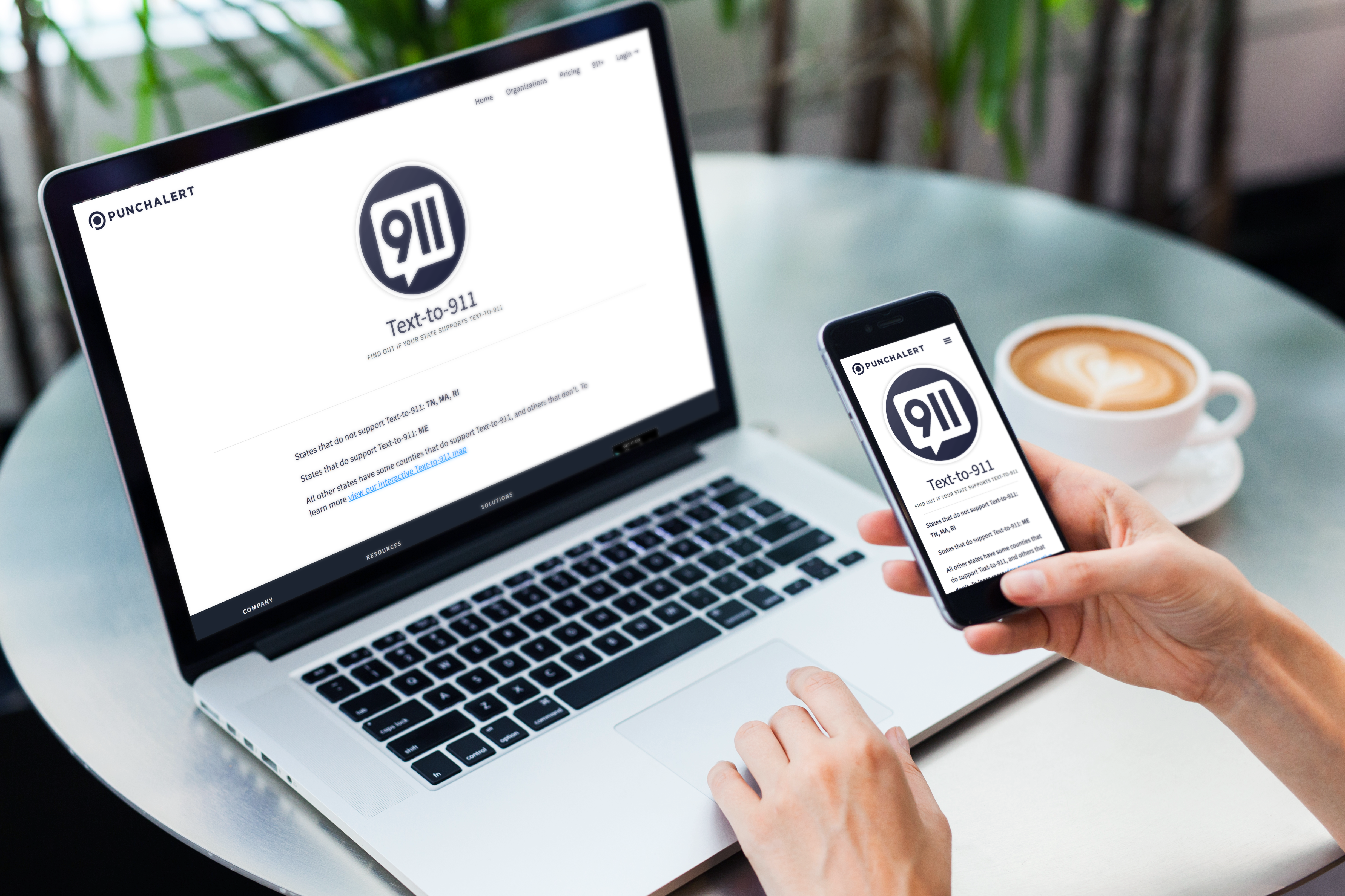
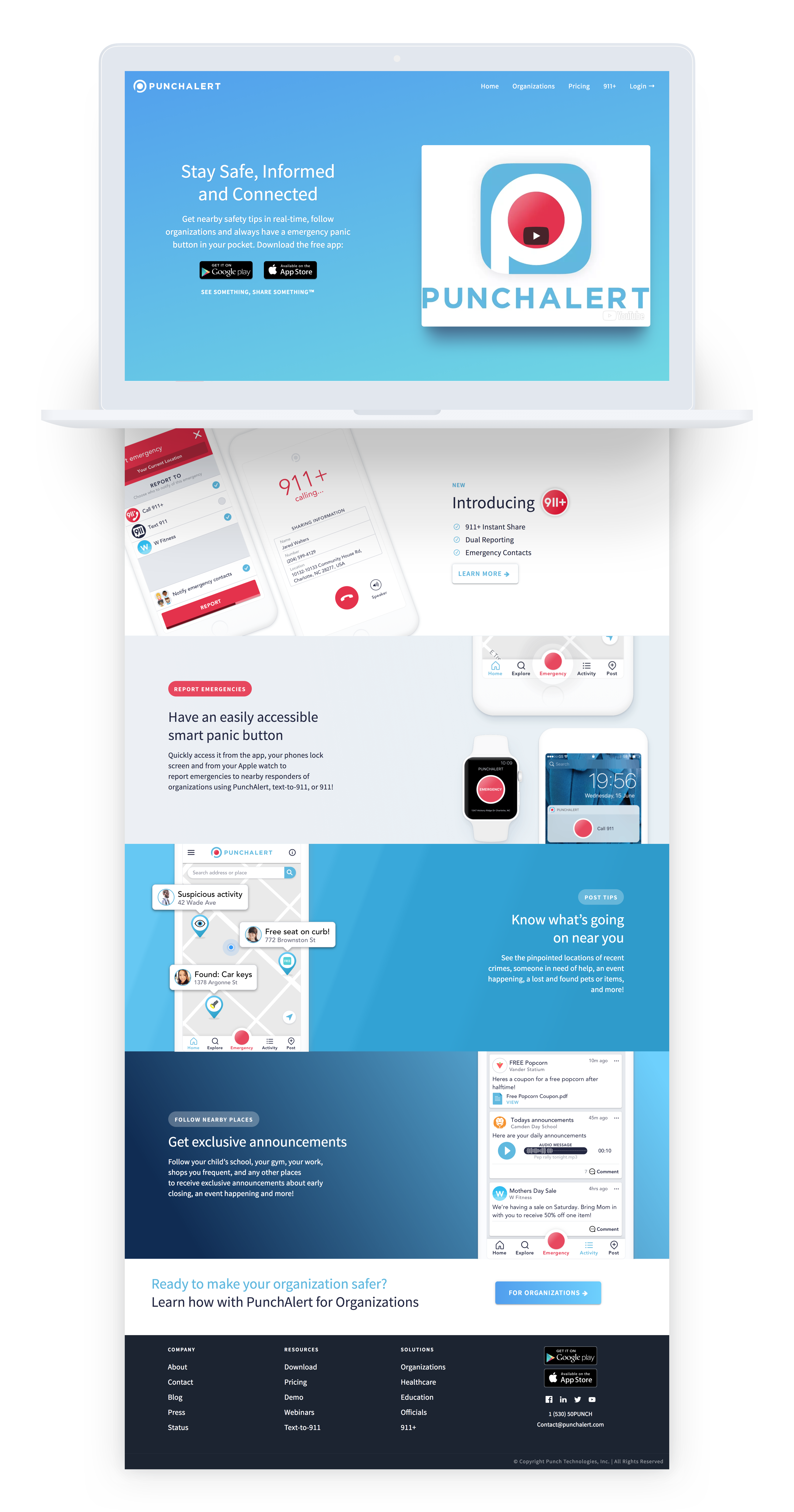
PunchAlert is a emergency management app used by schools, hospitals and other organizations. PunchAlert also has features for individuals to stay involved and informed in their community, like following organizations to receive announcements and posting tips to inform others nearby. The website is mainly used as a tool to explain what the app does and to promote the app to administrators interested in using it at their organization.
Before
Here’s a preview of the PunchAlert website prior to the redesign.
Process
For this website redesign I began by going through each page of the website, pin pointing the overarching usability issues. Here are some of those issues and how I fixed them:
-
readability
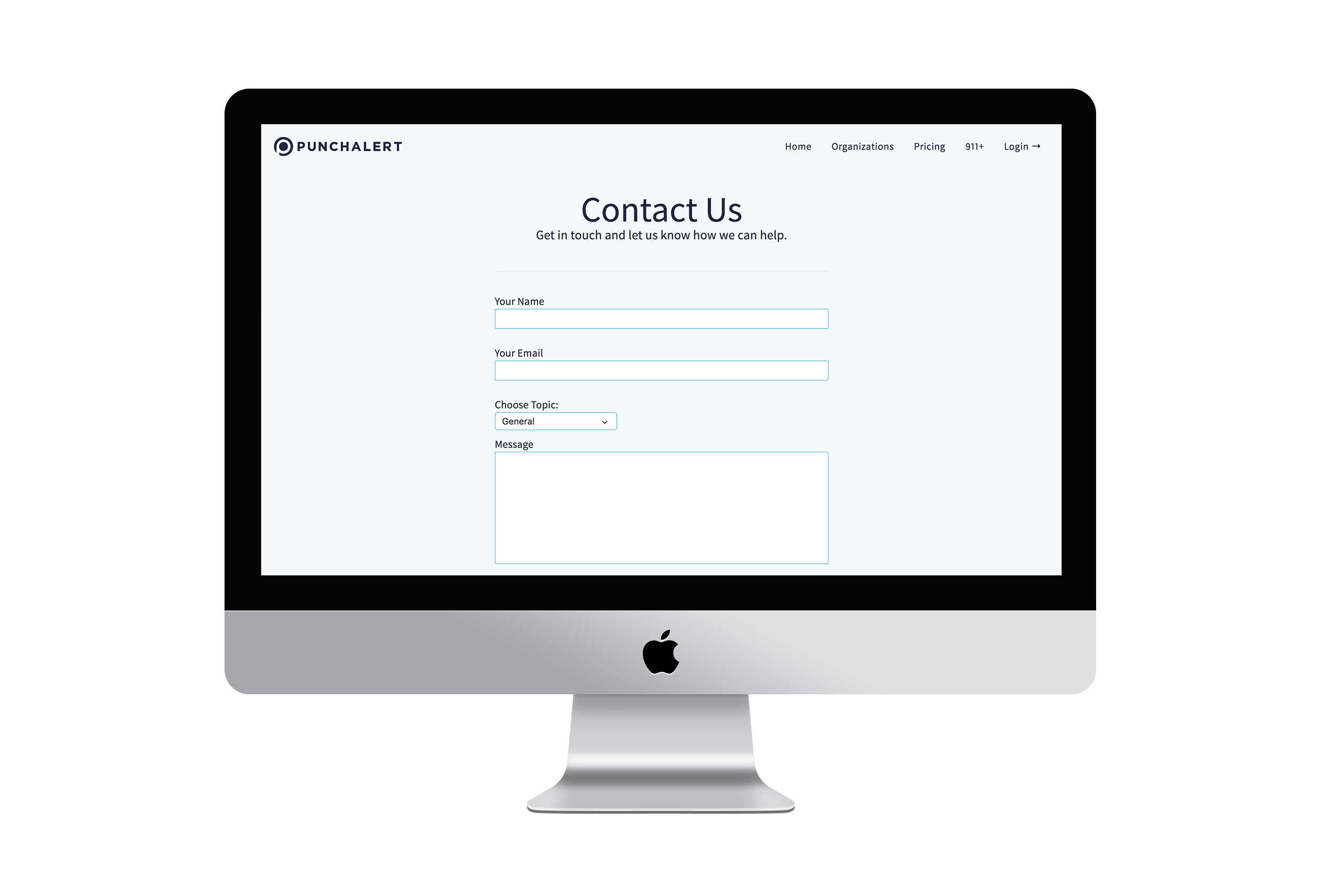
I did a full content audit, removing as much text as possible while maintaining the intended message. I also reformatted the content to support scanning, removed all technical jargon, created effective visual hierarchies, made it easier to tell what is clickable and took advantage of conventions. I made sure to create significant contrast between the page elements (text, icons, images, etc) and the background by being mindful while choosing colors, font styles and font weights.
-
Responsiveness
While going through the current website I checked how it looked in various browsers,(Chrome, Safari, Firefox, IE, etc.) on various devices (Desktop, Tablet and Mobile) and in all orientations (landscape and portrait). In doing this I took note of inconsistencies and areas that needed work and fixed those during the redesign by writing custom css media queries for those pages and being sure the new WordPress theme I chose was responsive across all browsers and devices.
-
touch targets
On mobile I noticed many of the links (especially in the footer) were placed to close together, making them difficult to press. In the redesign I made sure to have adequate margin and padding between buttons and a minimum touch target size of 44px x 44px.
-
Navigation
Regarding navigation I kept only the page links users need most often in the top navigation, included a “home” link and I used card sorting to group and organize the rest of the links in the footer.
-
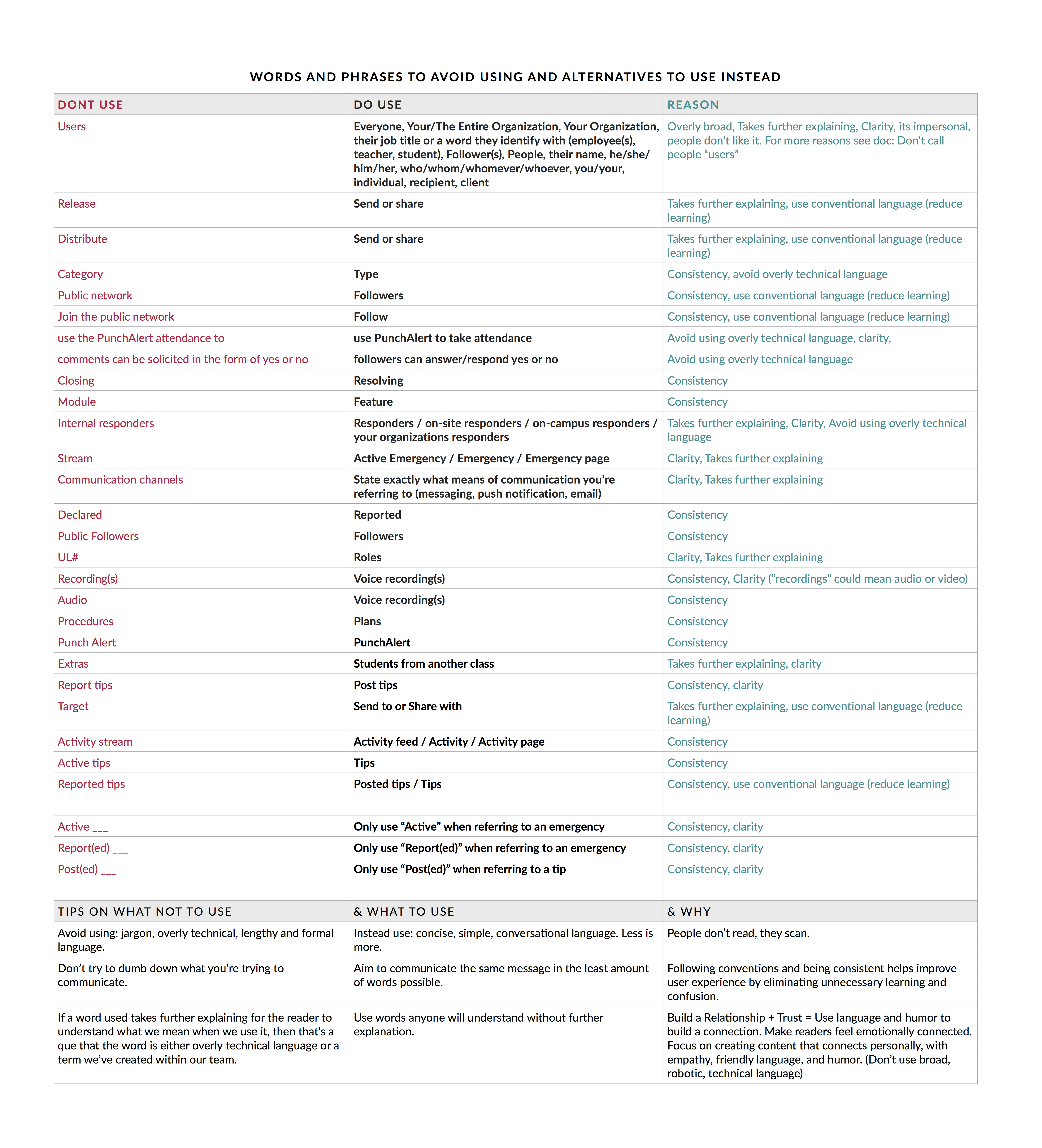
CONSISTENCY
One of the main issues I came across was the lack of consistency in the language used to describe and explain the product across the website and in the app. To fix this I created this document to use to check all content used to describe the product, to insure consistent language in current content and future content. As for style consistency I made sure to use a similar color palette and aesthetic on the website as I did the app, while strategically using specific formatting and color to differentiate between products and features.
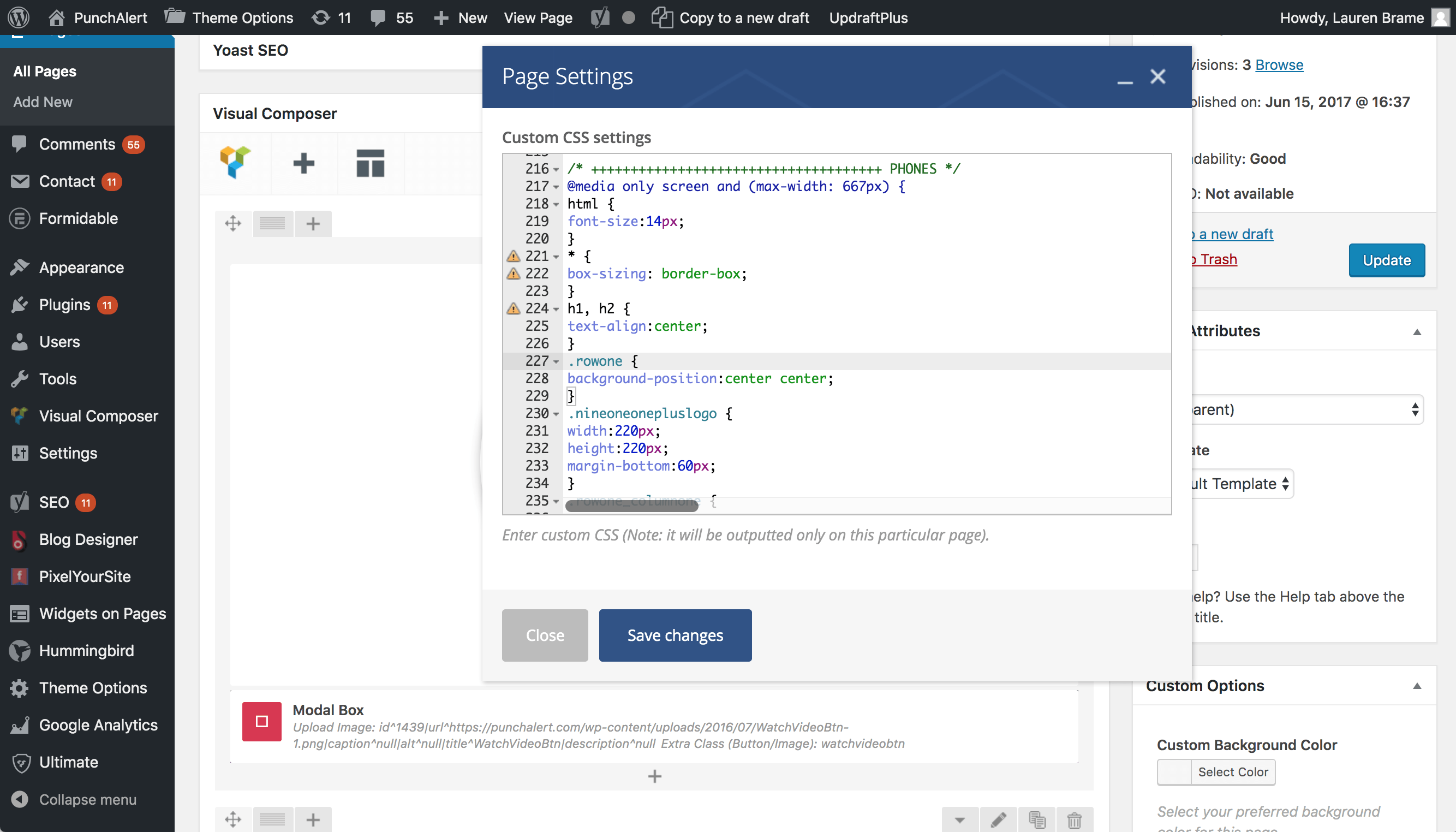
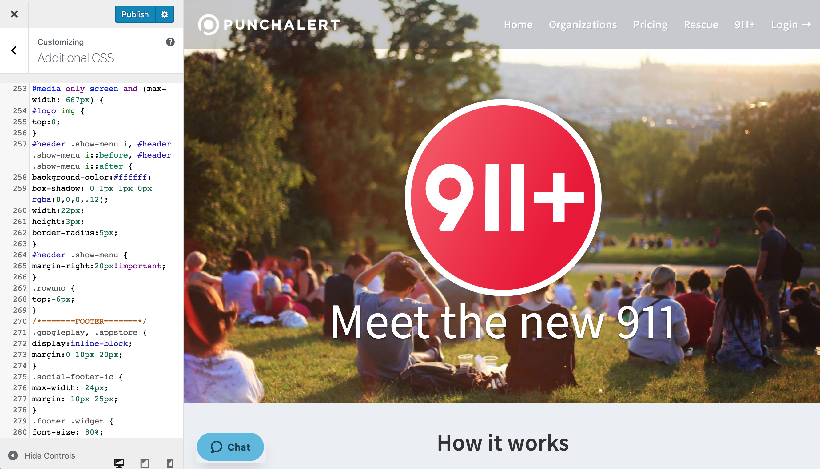
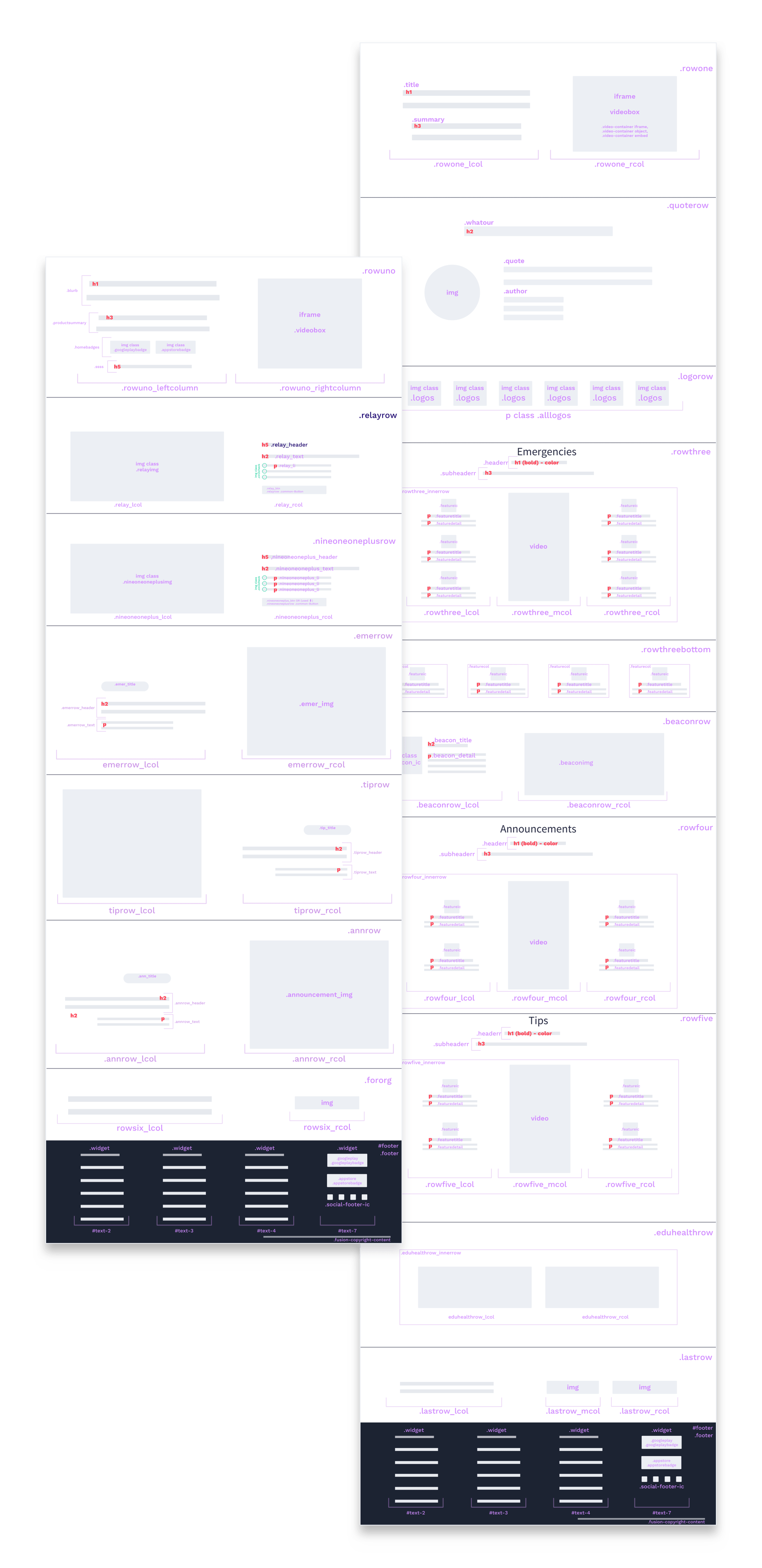
I created designs in a dev environment using WordPress, sharing links with the team on Slack to receive feedback. The new WordPress theme I chose to use for the redesigned website was not as responsive as I would like so I ended up writing a good amount of custom css (shown below).
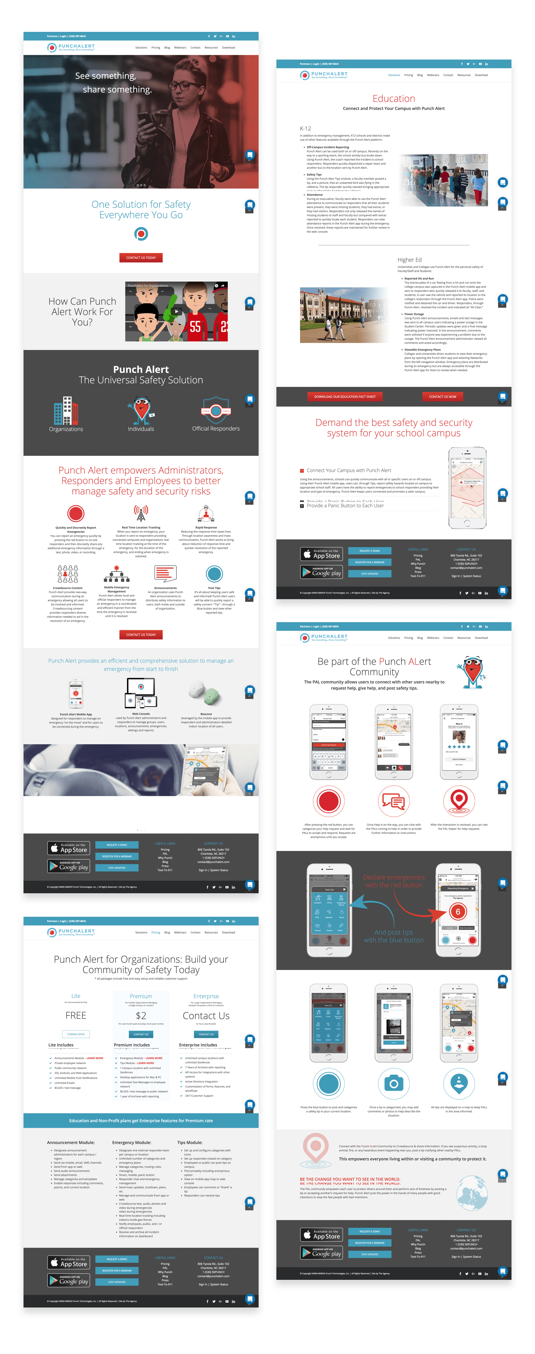
Final Designs