PunchAlert App Redesign
Tools Used


Services Provided
iOS App Design, Android App Design, Apple Watch App Design, Tablet & iPad App Design, User Experience Design, User Interface Design, Interaction Design, Product Design
Client
Punch Technologies
Year
2016-2019
The PunchAlert app provides schools, gyms, hospitals, and many other organizations with a way to communicate efficiently during an emergency to resolve it in the fastest way possible.This allows employees and security guards a way to communicate through text messages, phone calls, photos, videos and voice recordings to determine if action should be taken while waiting for police to arrive. Afterward, the organizations’ administrators can look back on a documented record of all incidents to see where there is room for improvement. The app also gives the option to send a notification containing the emergency plan to the entire organization (i.e. not just employees, but also students) to keep everyone safe and informed. Outside of emergencies anyone can post and view tips in their community or while at an organization, as well as follow organizations to receive announcements.
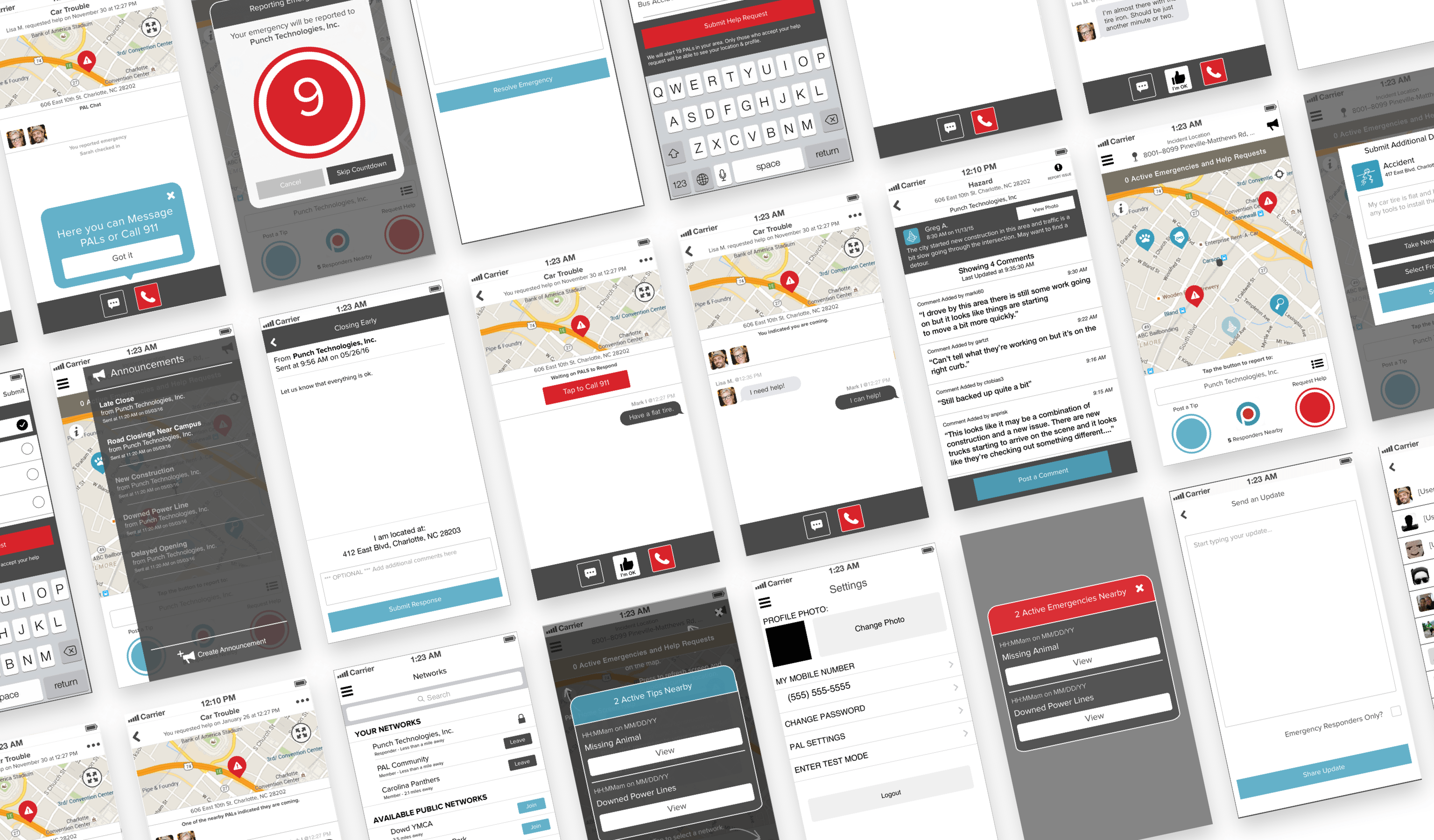
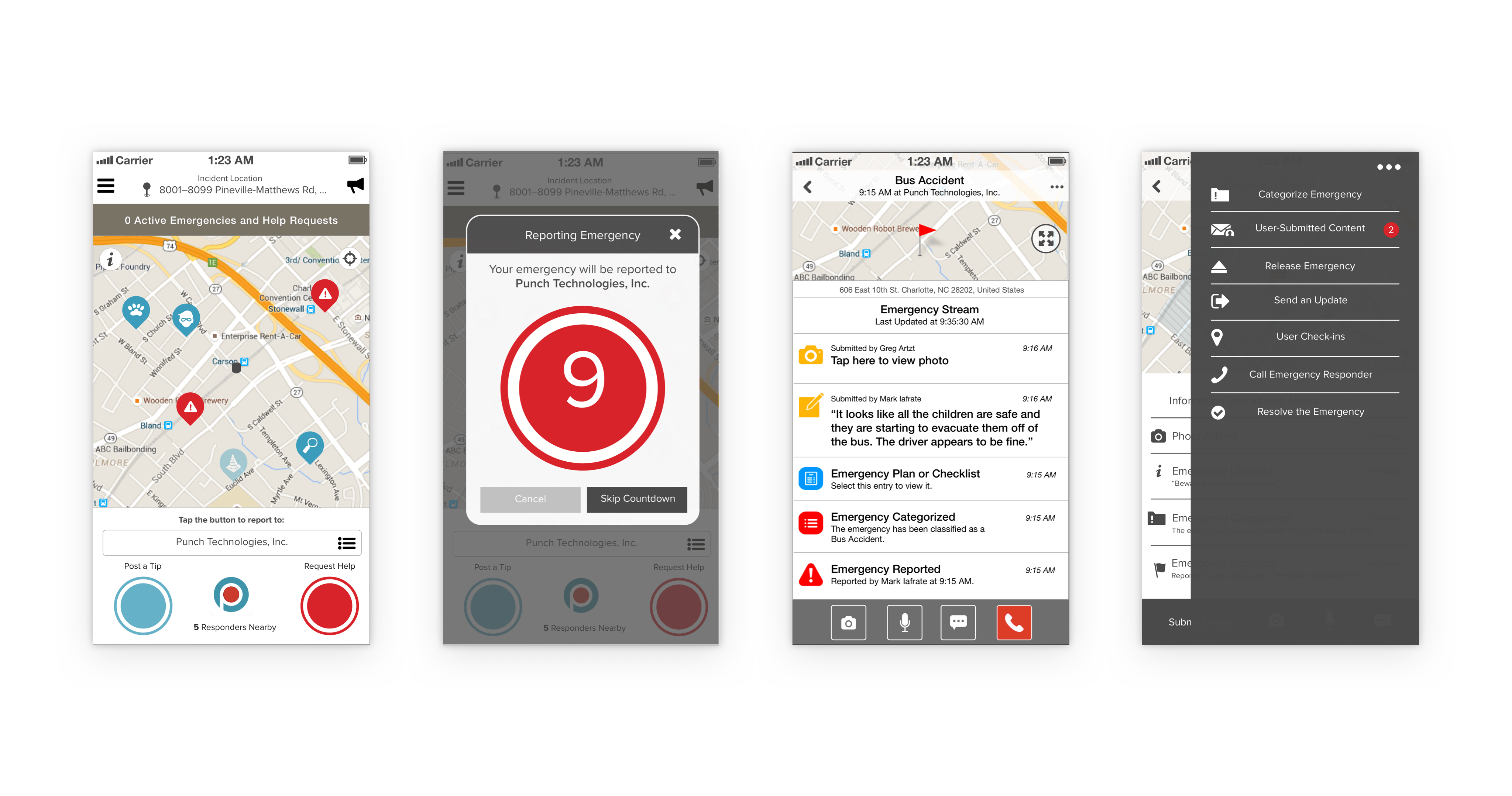
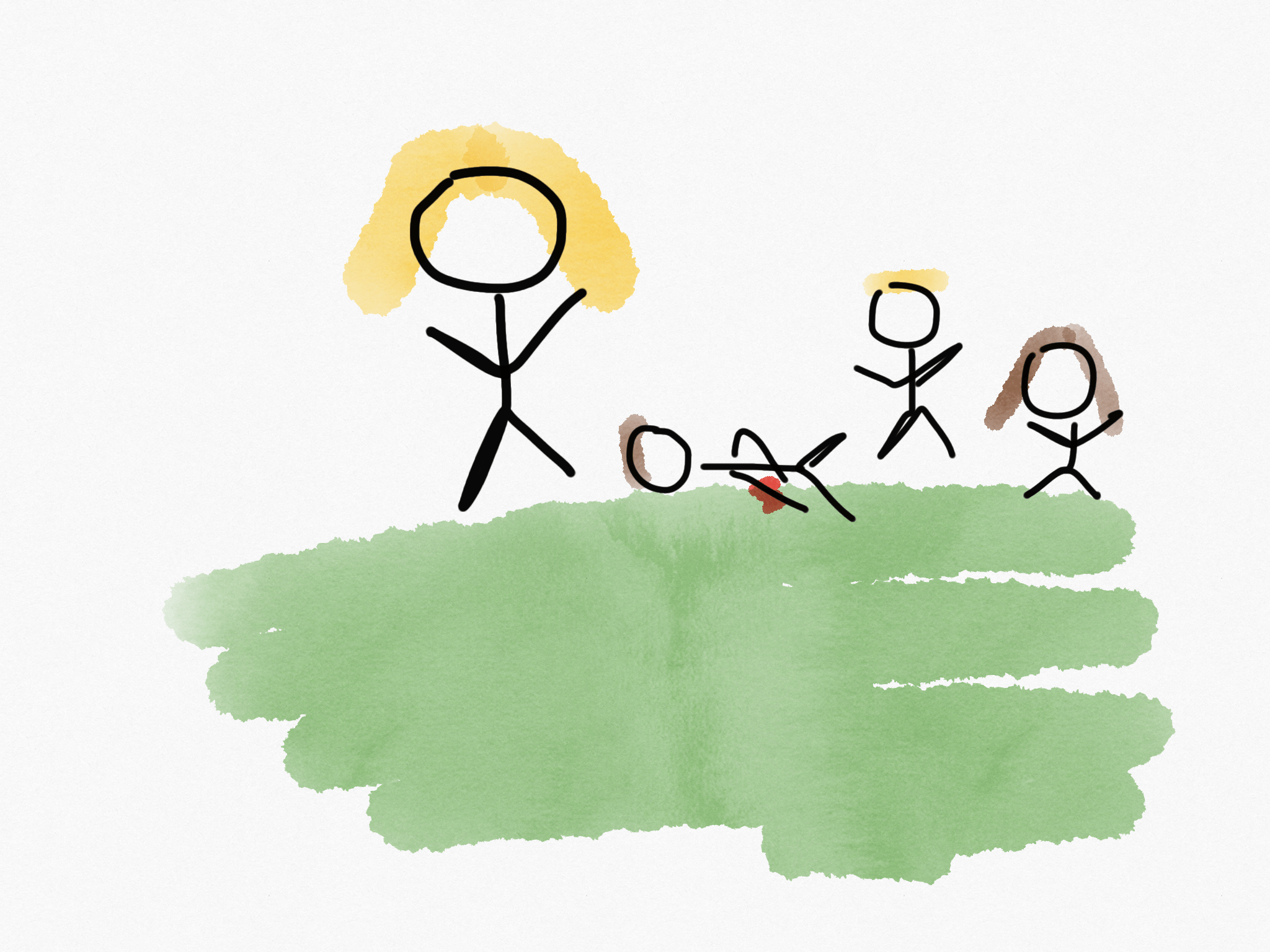
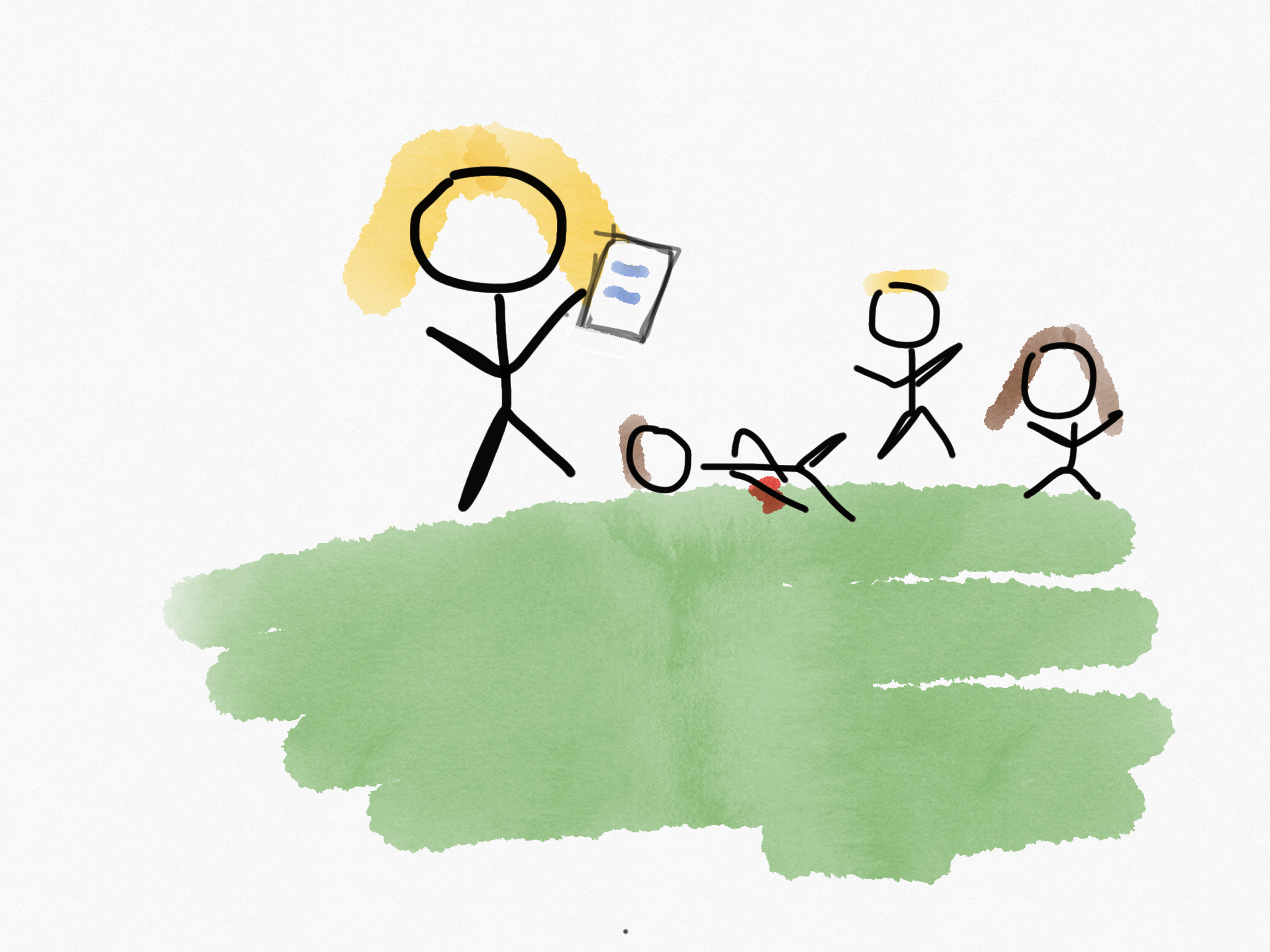
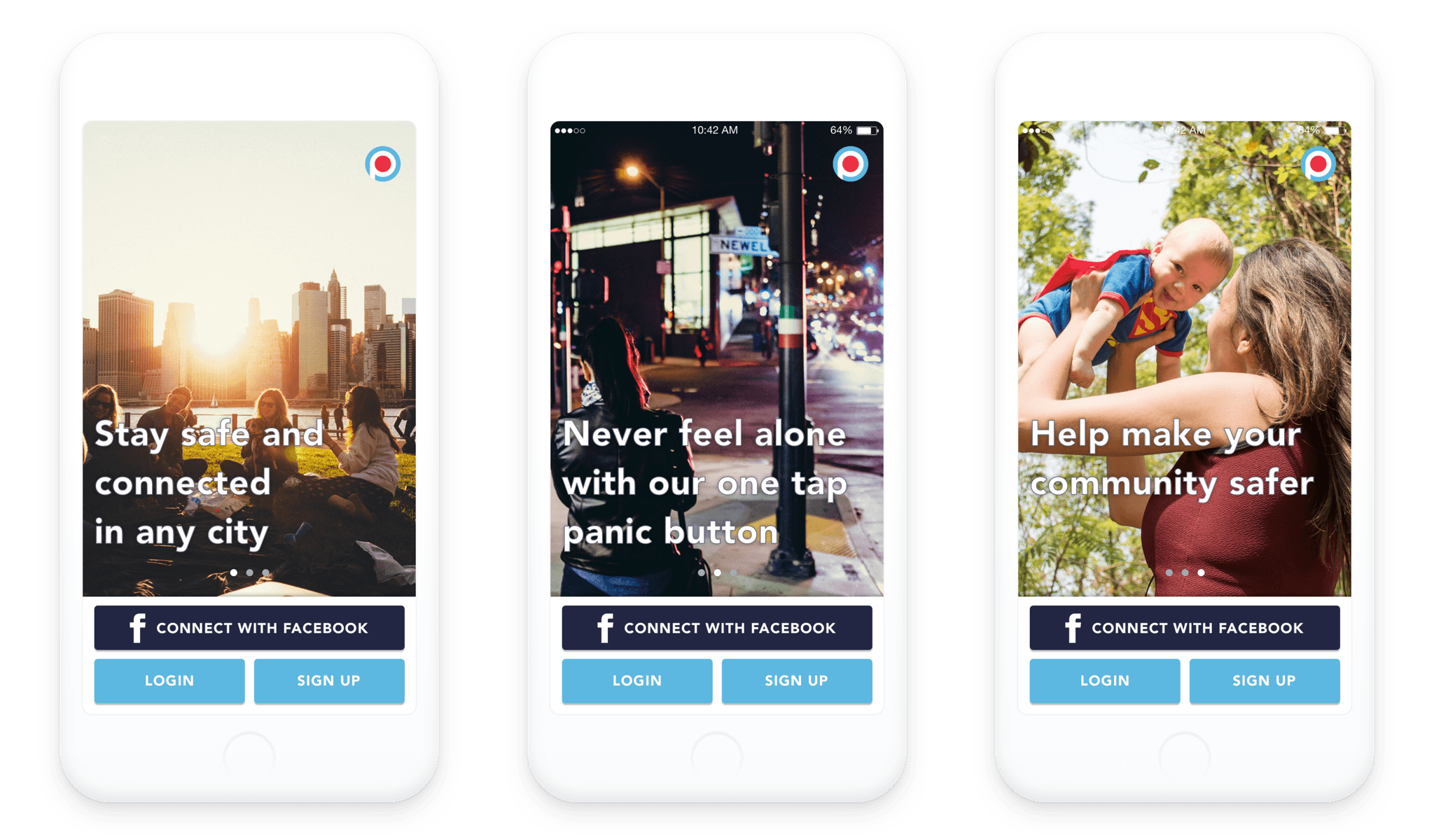
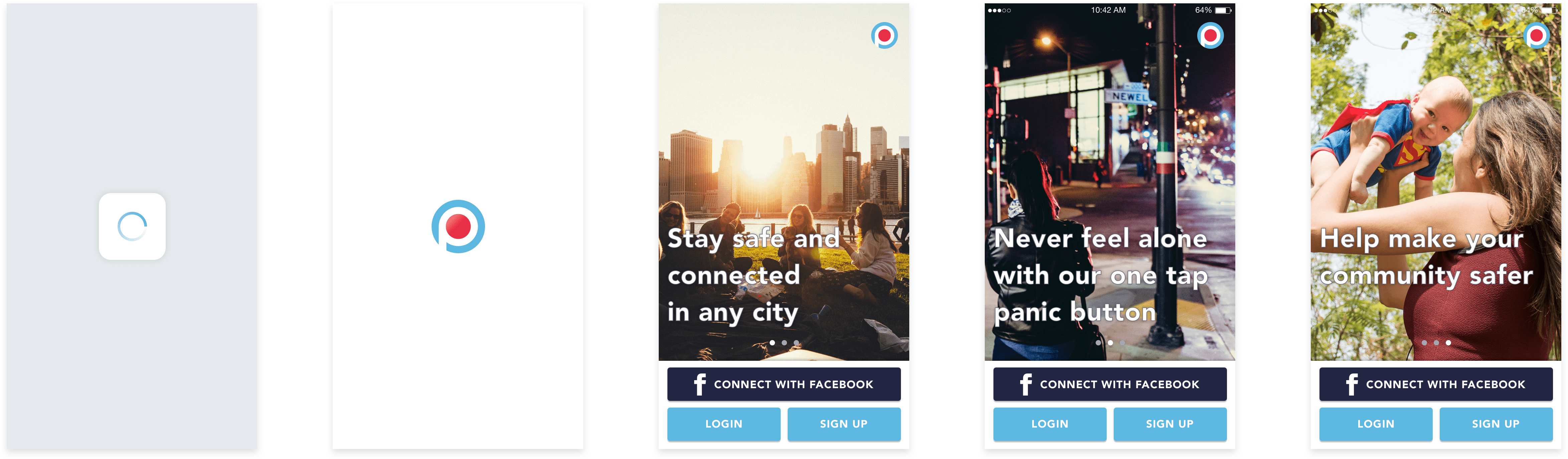
Below is a preview of the PunchAlert app prior to the redesign. The top image showing an overview of the original UI and features. The bottom image shows (from left to right): the original home screen, the screen that appears if the red emergency button was pressed on the home screen, an example of how an active emergency looked, and the original manage emergency screen.
Prior to the redesign, PunchAlert relied on in-person training sessions to teach the employees of an organization new to PunchAlert how to use the app. Also, there was no way for a non-employees to use the app, and organizations (for example: schools) wanted non-employee’s to be able to follow and receive announcements in the app.
The redesigns main objective was to allow for new organizations to begin using PunchAlert in a faster and easier way, and without the need for in-person training. In addition to improving the entire apps onboarding and overall experience, the secondary objective was to design the app in such a way that anyone (for example: a parent of a child whose school uses PunchAlert) could download and easily use the app.
I began by speaking with everyone from the CEO to the developers, customers and investors, to understand the business goals, where they felt the current app worked well and where it didn’t, how the app is used and by who, and what they wanted out of this redesign. Then I dissected the current app to develop a deep understanding of the how the app worked, purpose of each element on every screen and how every feature came about.
A few of the high level goals of this redesign were:
- Create a way for the public to use the app to stay better connected to their community and organizations.
- Improve the current overall experience by incorporating more convention into the app and making it more user friendly.
- Maintain or improve upon all existing functionality in the product.
- Make it easier for users to sign up, join (with permission) organizations as an employee, follow organizations, and interact in the community or with organizations.
- Add friends/family (emergency contacts) option for emergency reporting.
- Give organizations a way to send announcements through the app only.
- Make it easier for organizations to reach and interact with their public followers as well as their employees.
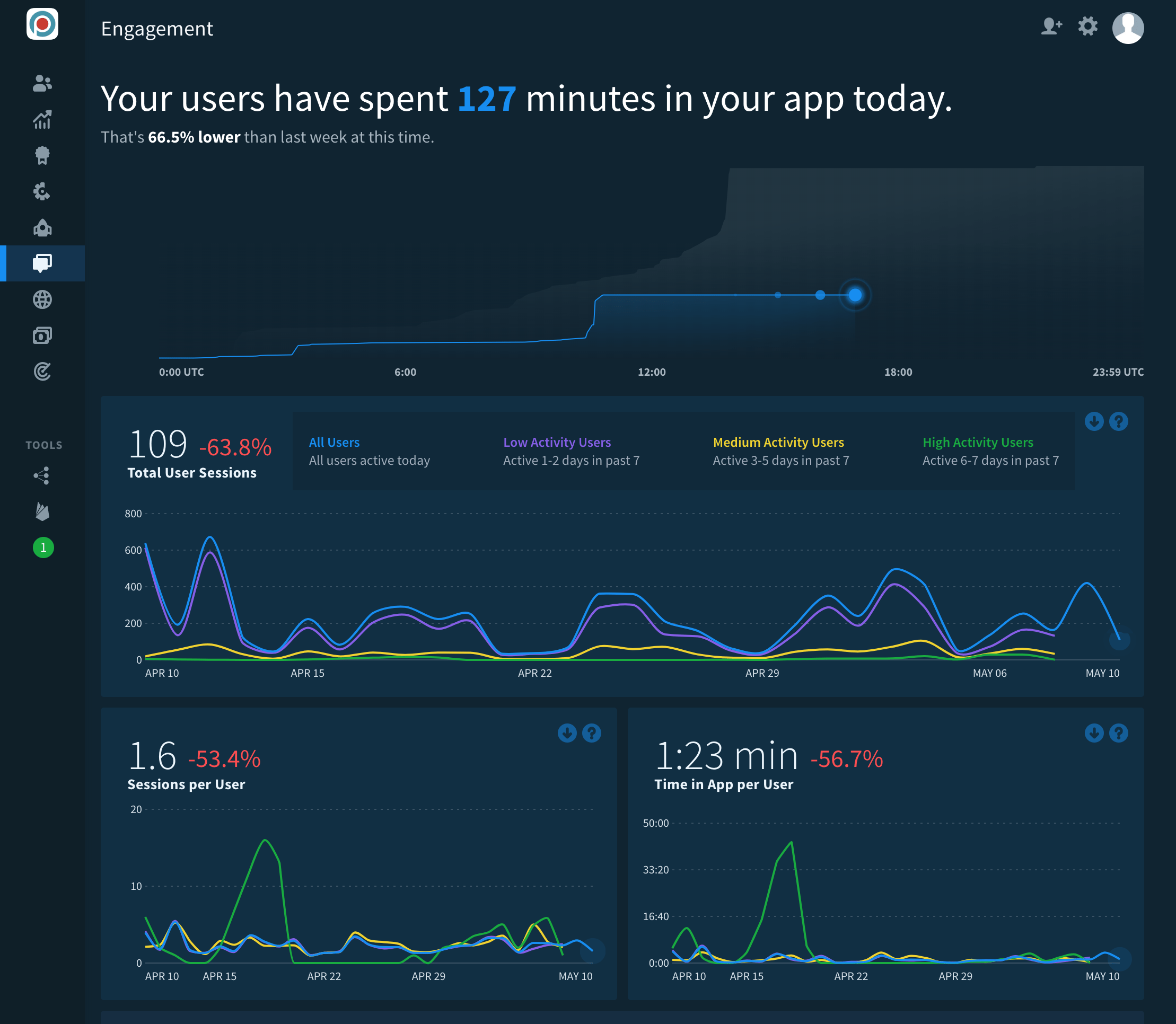
USER DATA
As part of my research for this redesign I began by going through the PunchAlert admin web console collecting user data regarding how the app was used, how often it was used, when, and by whom. I also collected data using Fabric.io, screenshots from both are shown below. Note that the design of the admin web console is not my own.
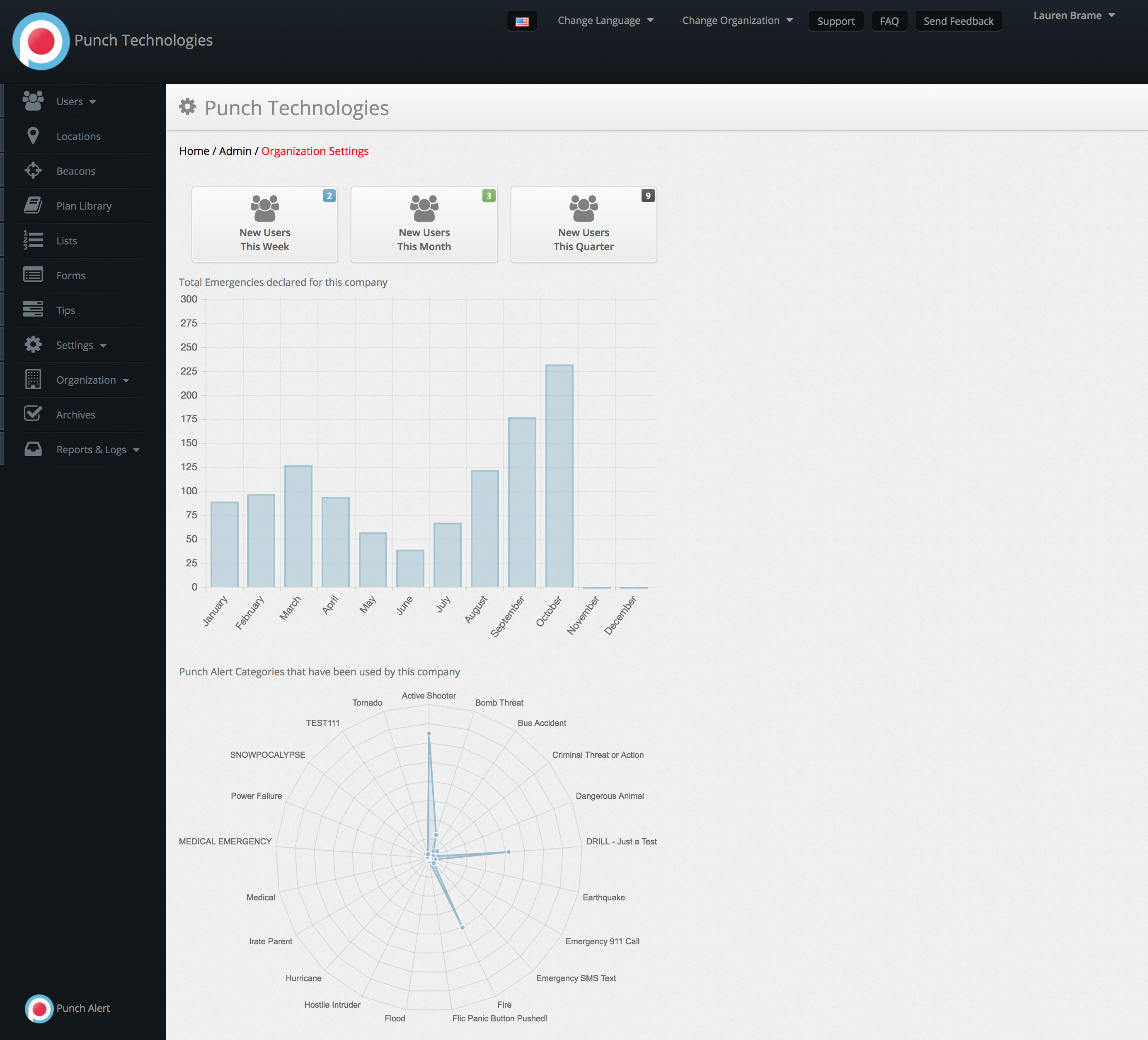
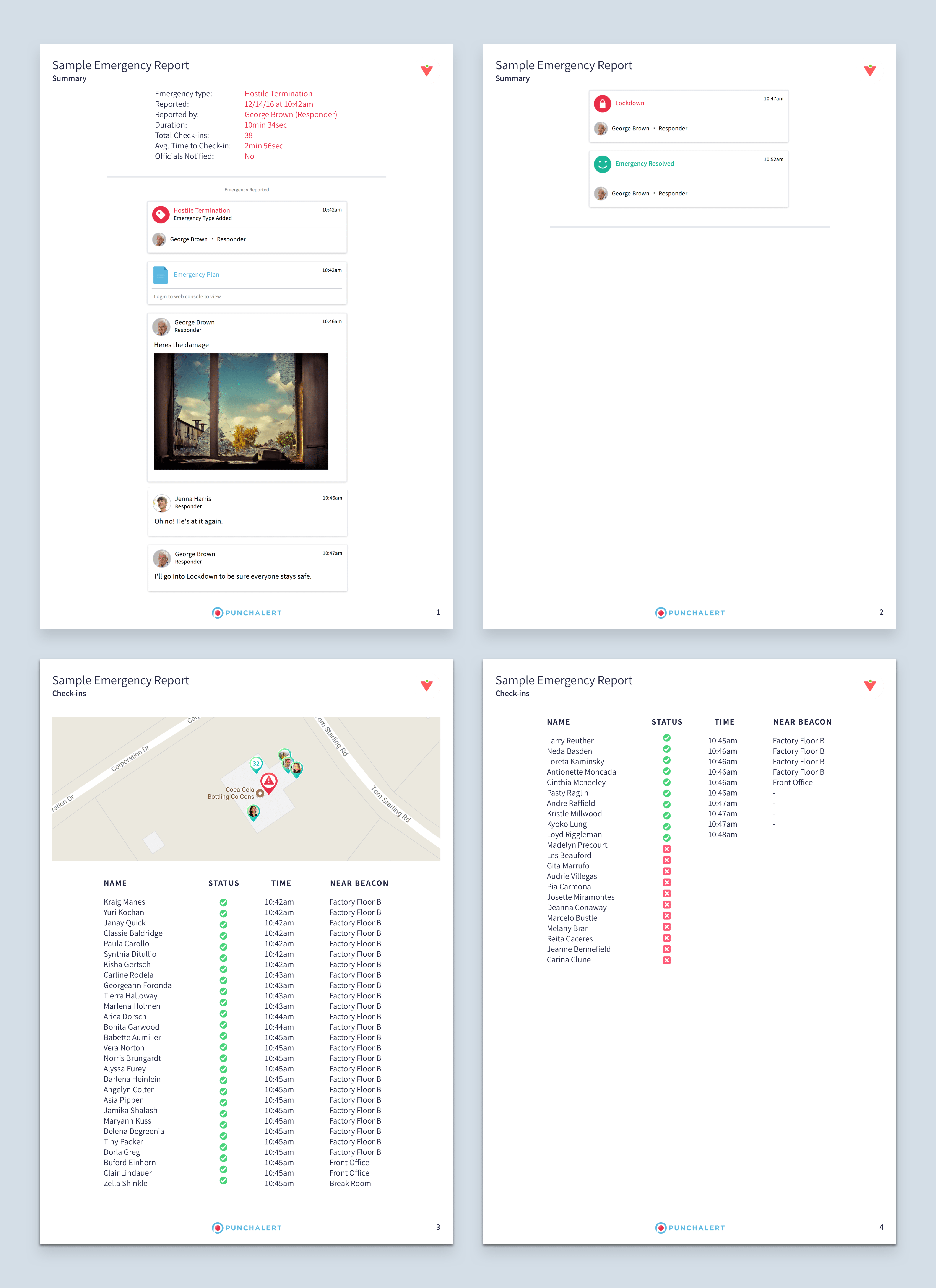
Below is an example of a printable emergency report to better show the kind of data I was able to collect from the admin web console. Note that this is just an example design using ipsum, I did not want to use a screenshot of a real emergency report for privacy concerns.
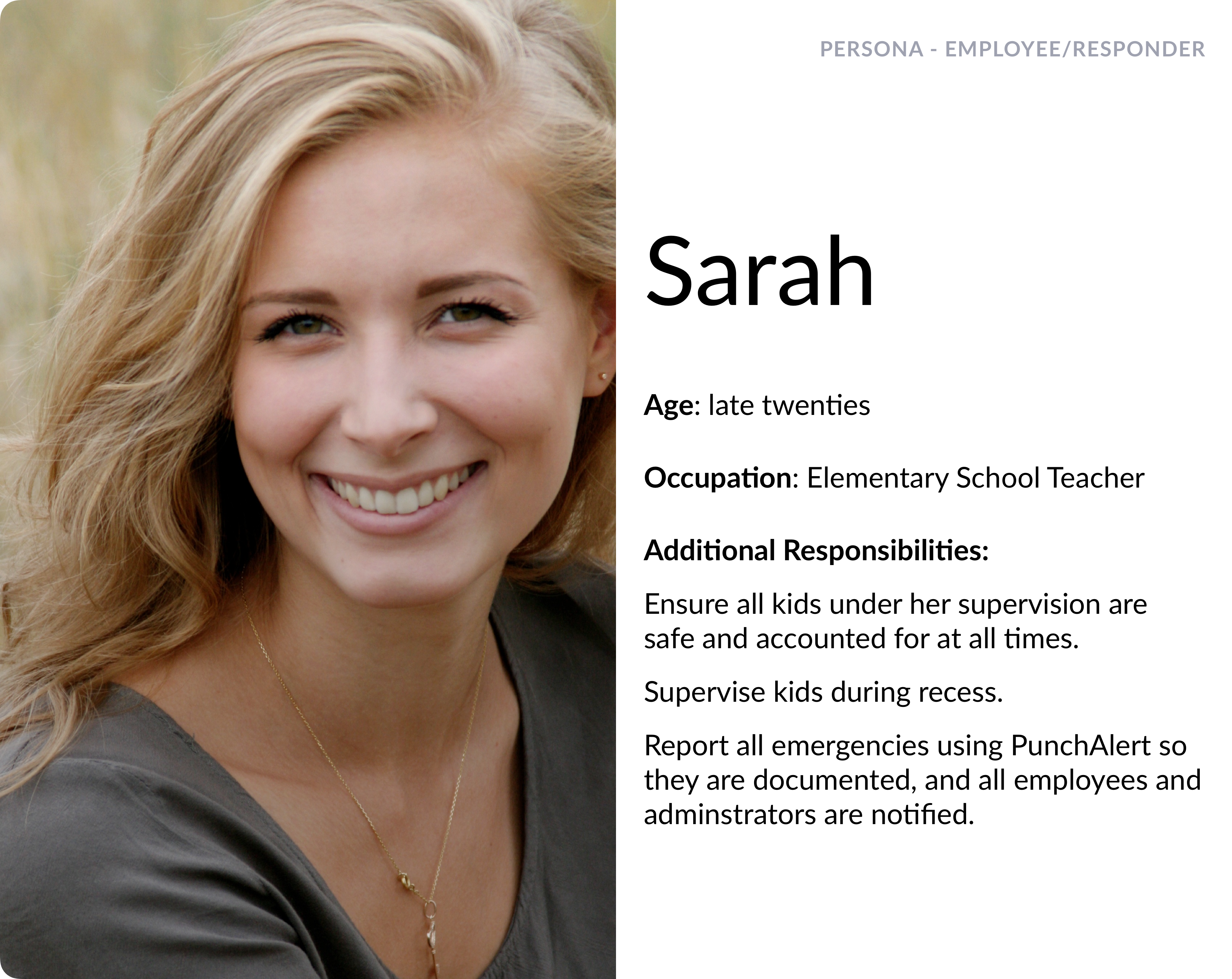
PERSONA
USE CASE
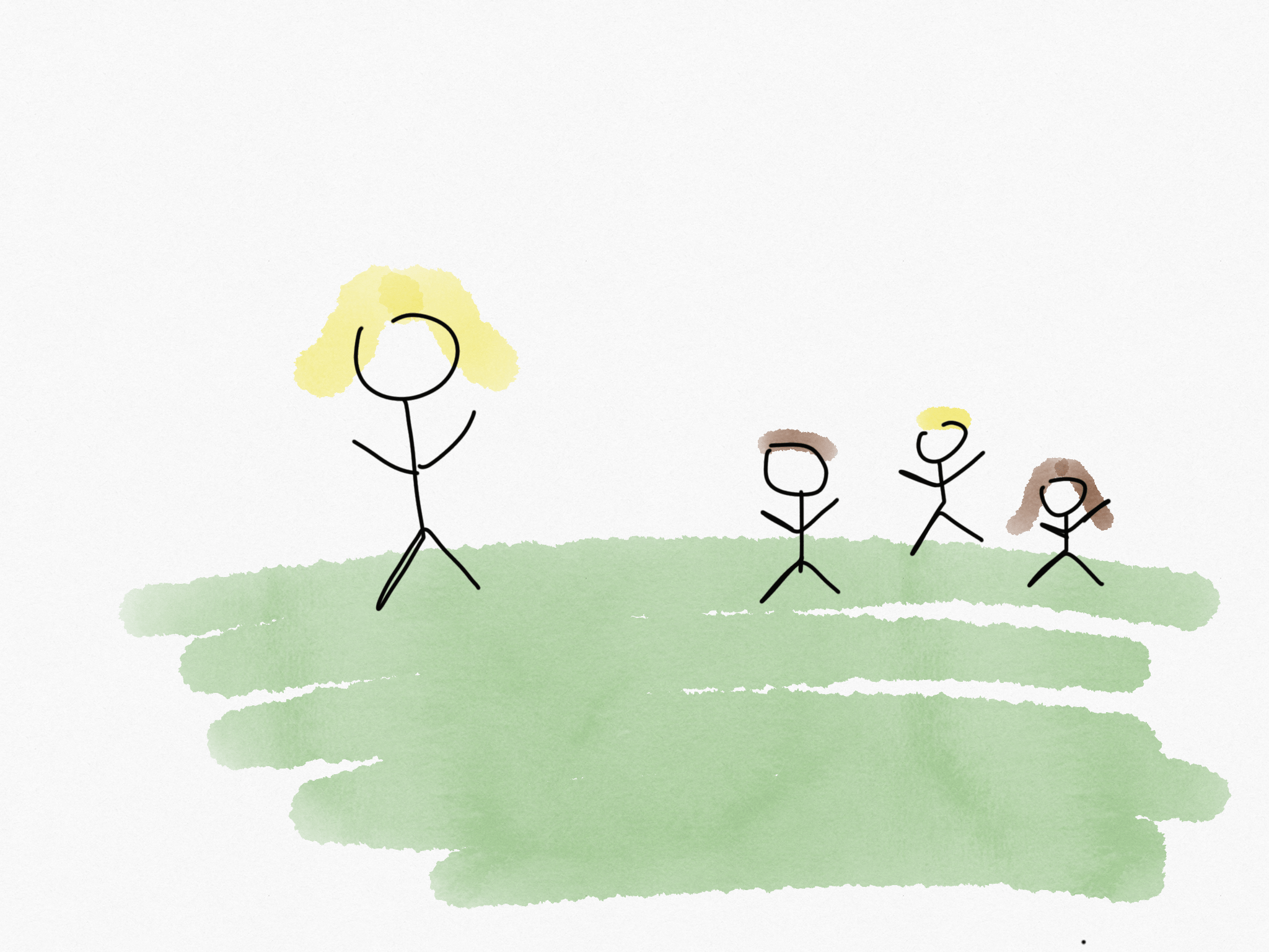
Sarah is outside watching kids play after school.
↓
Tommy falls and hurts his arm.
↓
Sarah reports the injury using PunchAlert notifying the nurse and the administrator who calls Tommy’s mom to come pick him up.
↓
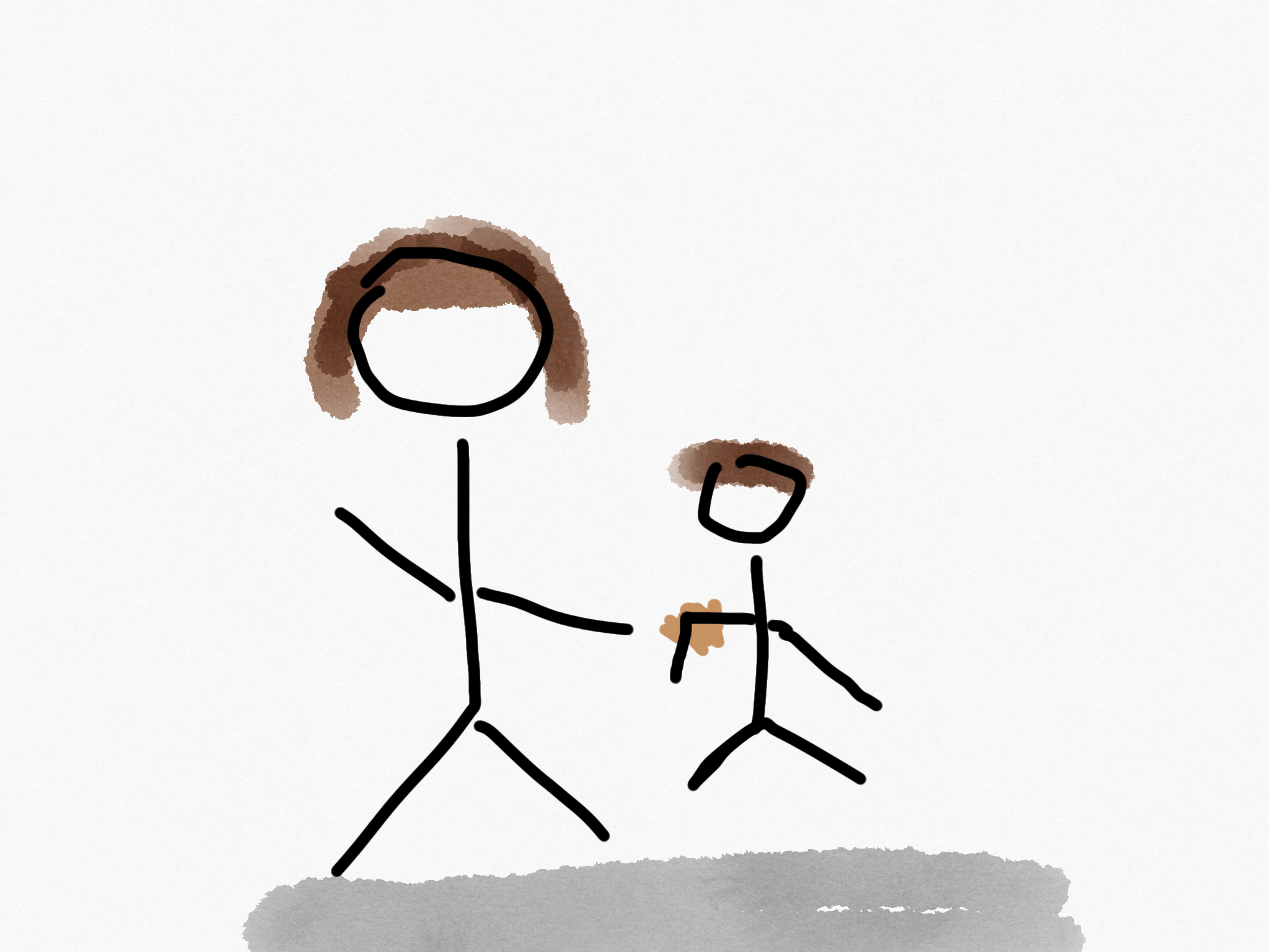
When Tommy gets to the nurses office his mom is already waiting there for him.
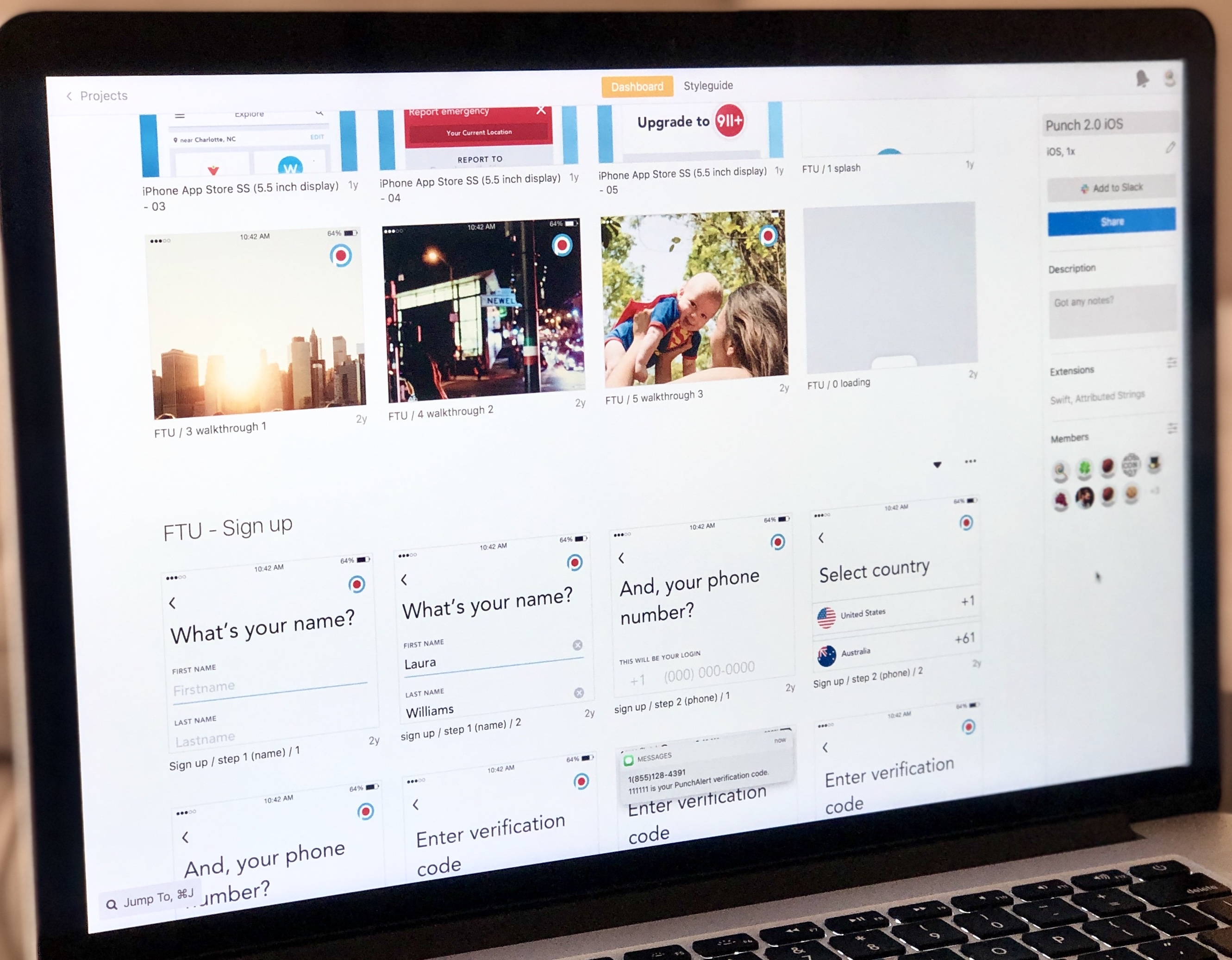
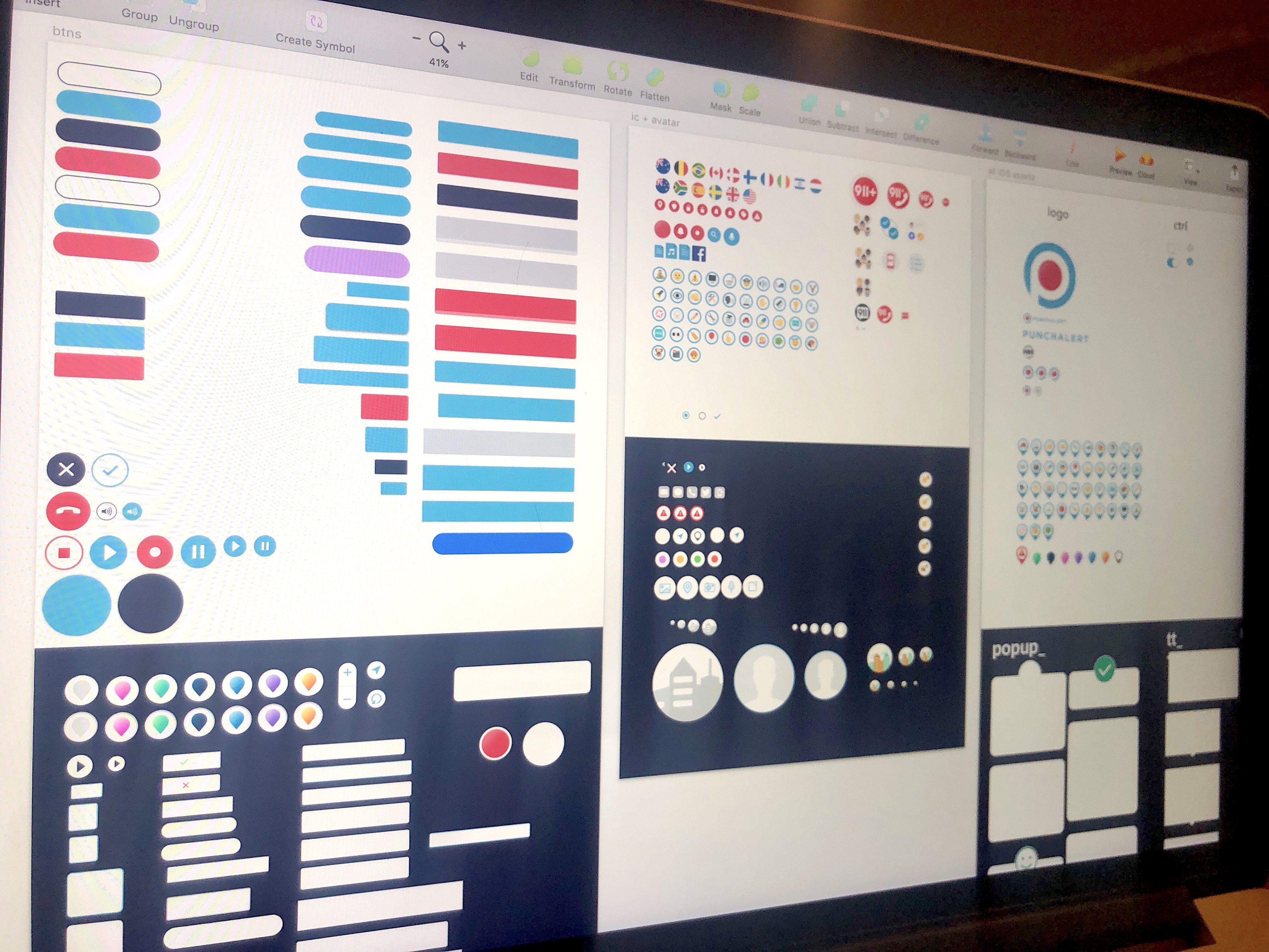
Next I iterated, beginning on whiteboard and paper to then working my way up to digital mockups. I continued iterating and receiving feedback until all the goals were met, the problems were solved and the entire team was happy with the new overall UI style as well as the new architecture, flow and functionality of the app. In total there were over 5k screen iterations.
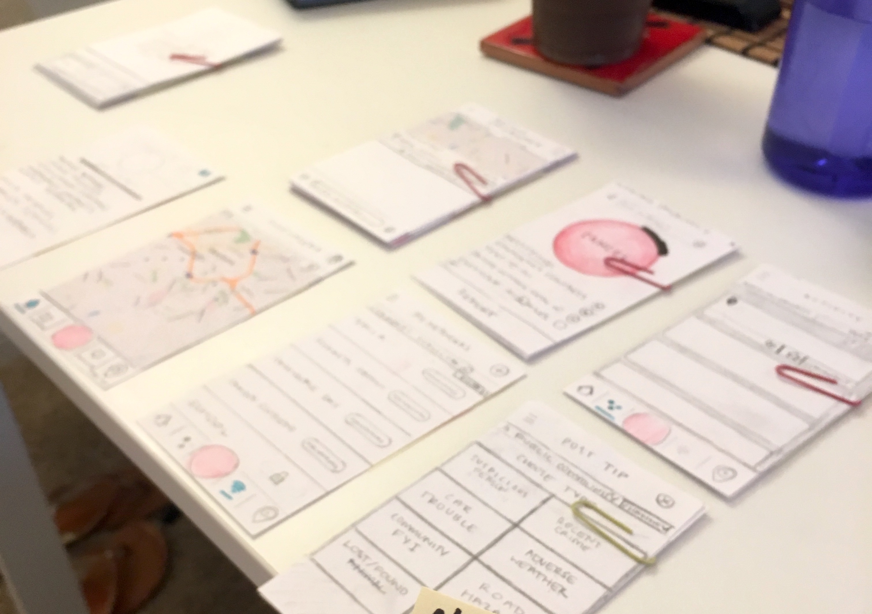
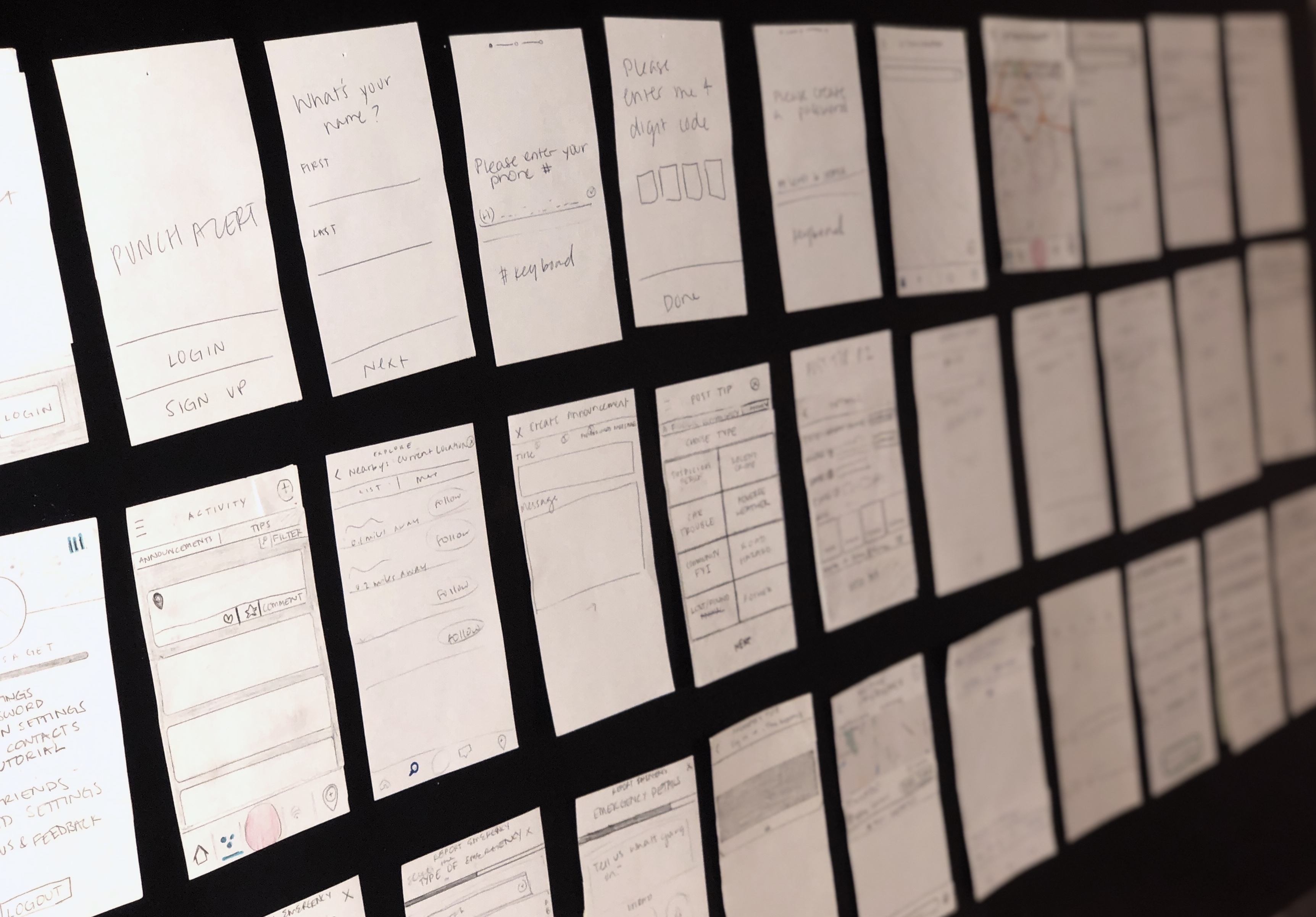
↑ Some of the draft iterations of the report emergency experience
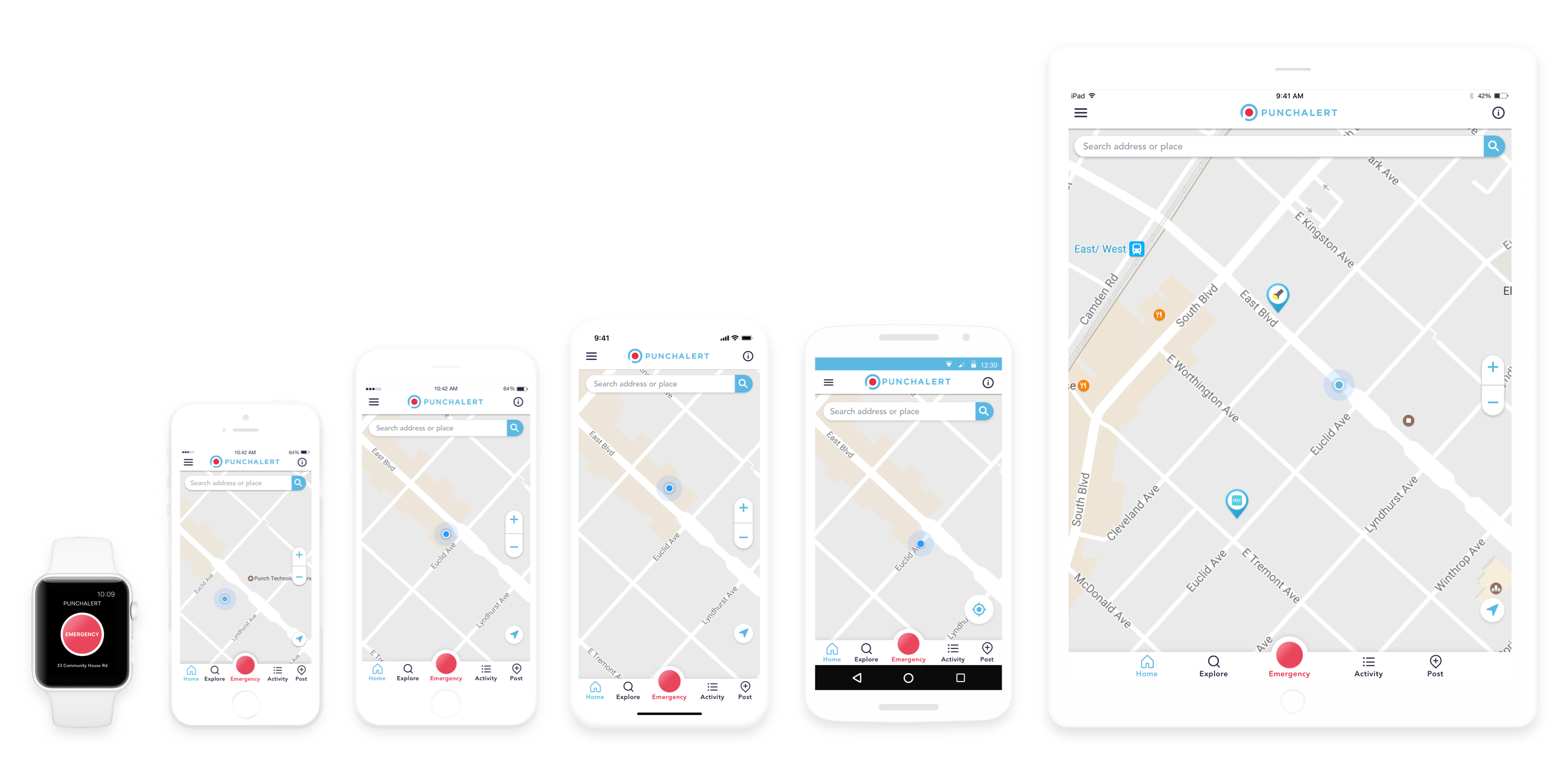
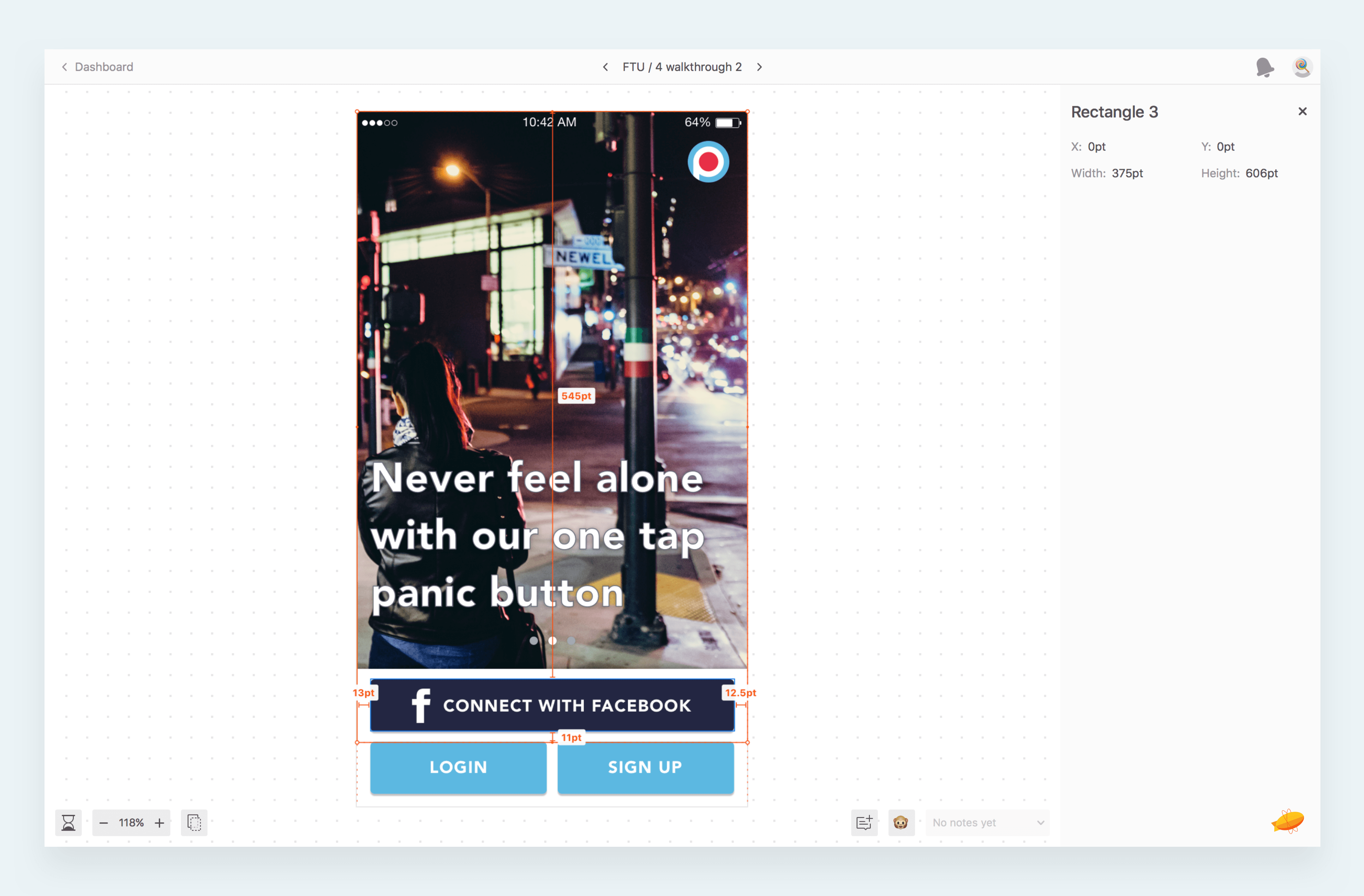
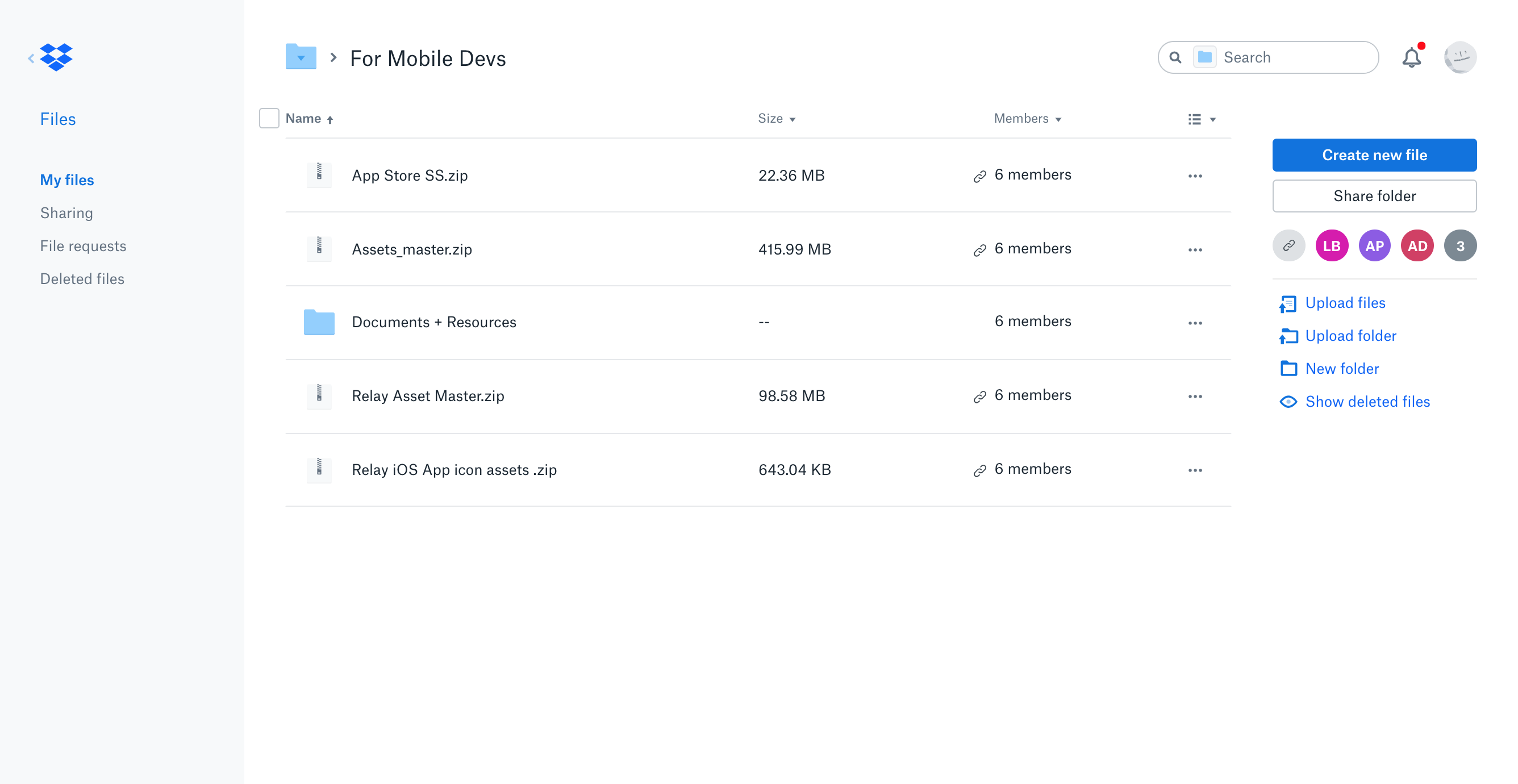
I used Slack, Gmail and Zoom to communicate with the team throughout the entire process. Once designs were finalized, I completed all the design size variations of the entire app (Apple watch, iPhone SE, iPhone, iPhone X, iPad, and Android). I used Zeplin.io to share designs and specs with developers, and Dropbox to share assets with developers and designs to marketing and the team.
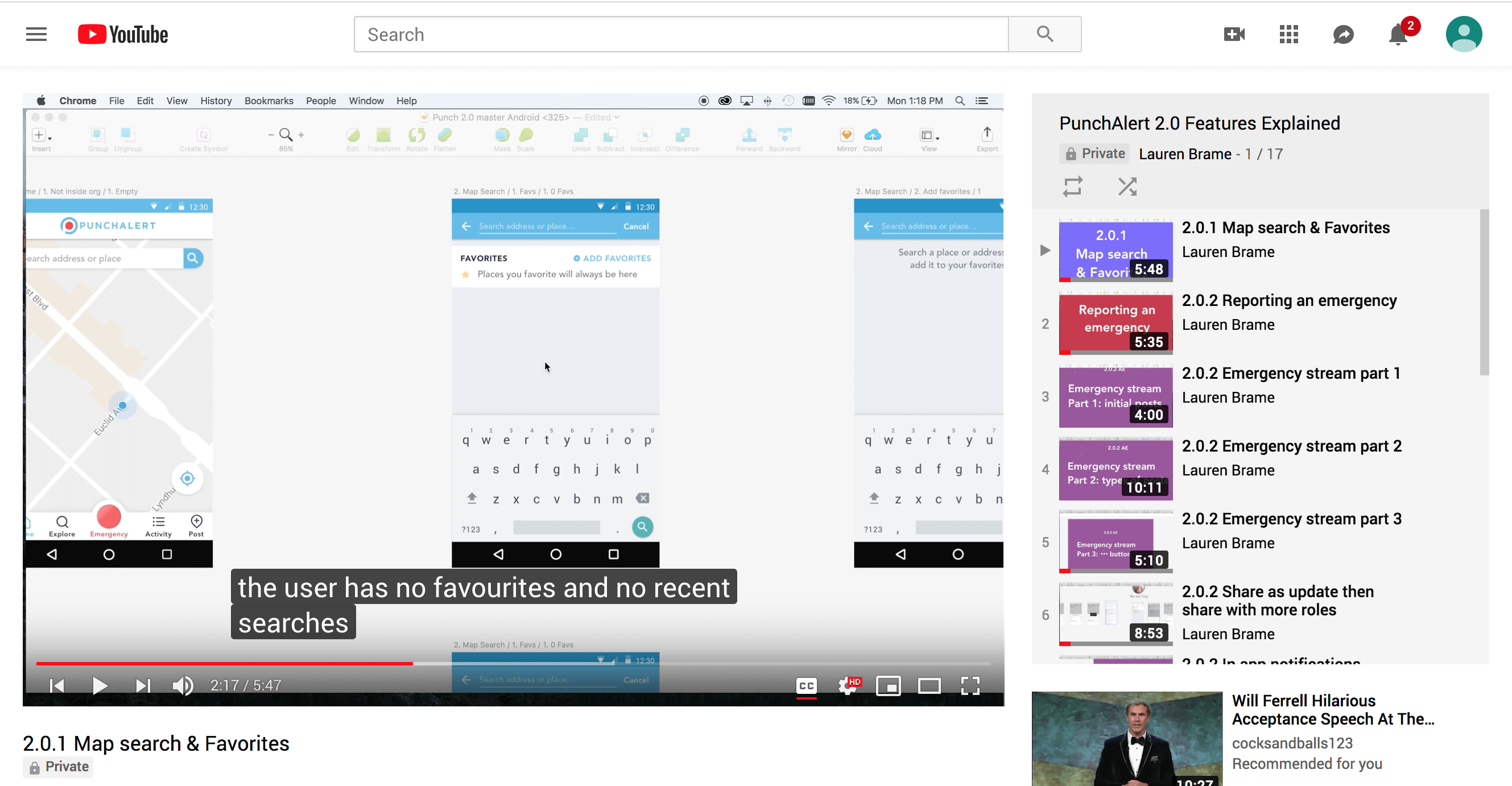
Then to ensure the app flow and intended functionality was communicated to the best of my ability I created a series of short screen capture videos of me talking through all the screens of each section including how, when and which specific type of user would get from screen A to screen B then back to screen A. I uploaded these videos to youtube and shared with the team and developers.I used After Effects to show the team any specific interactions and animations.
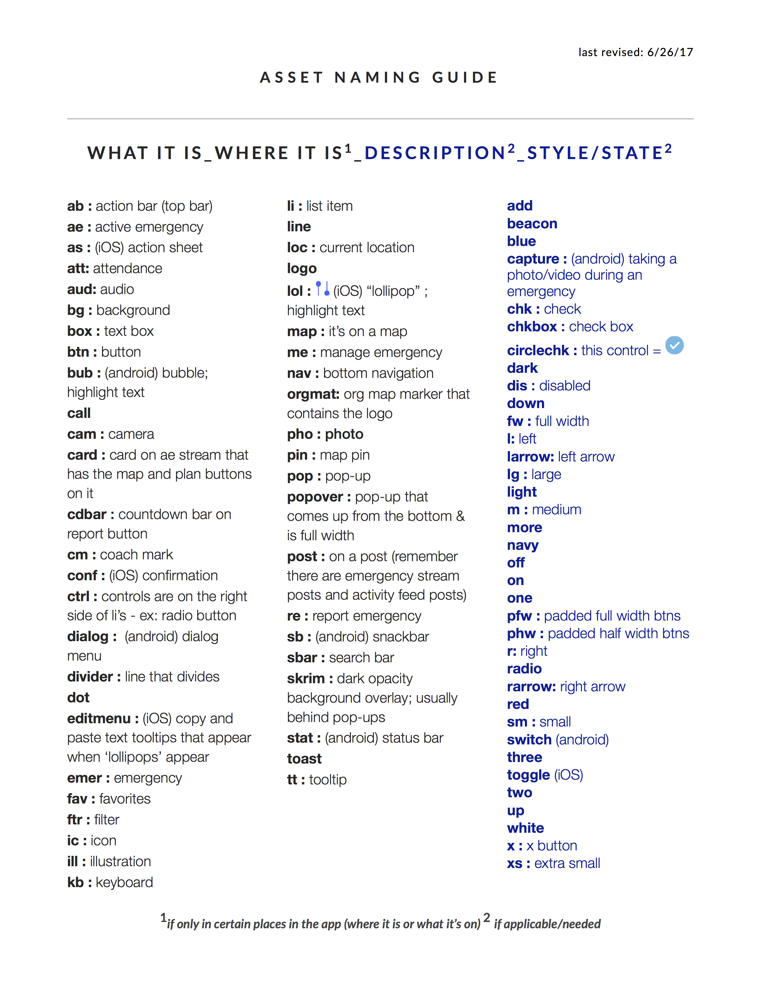
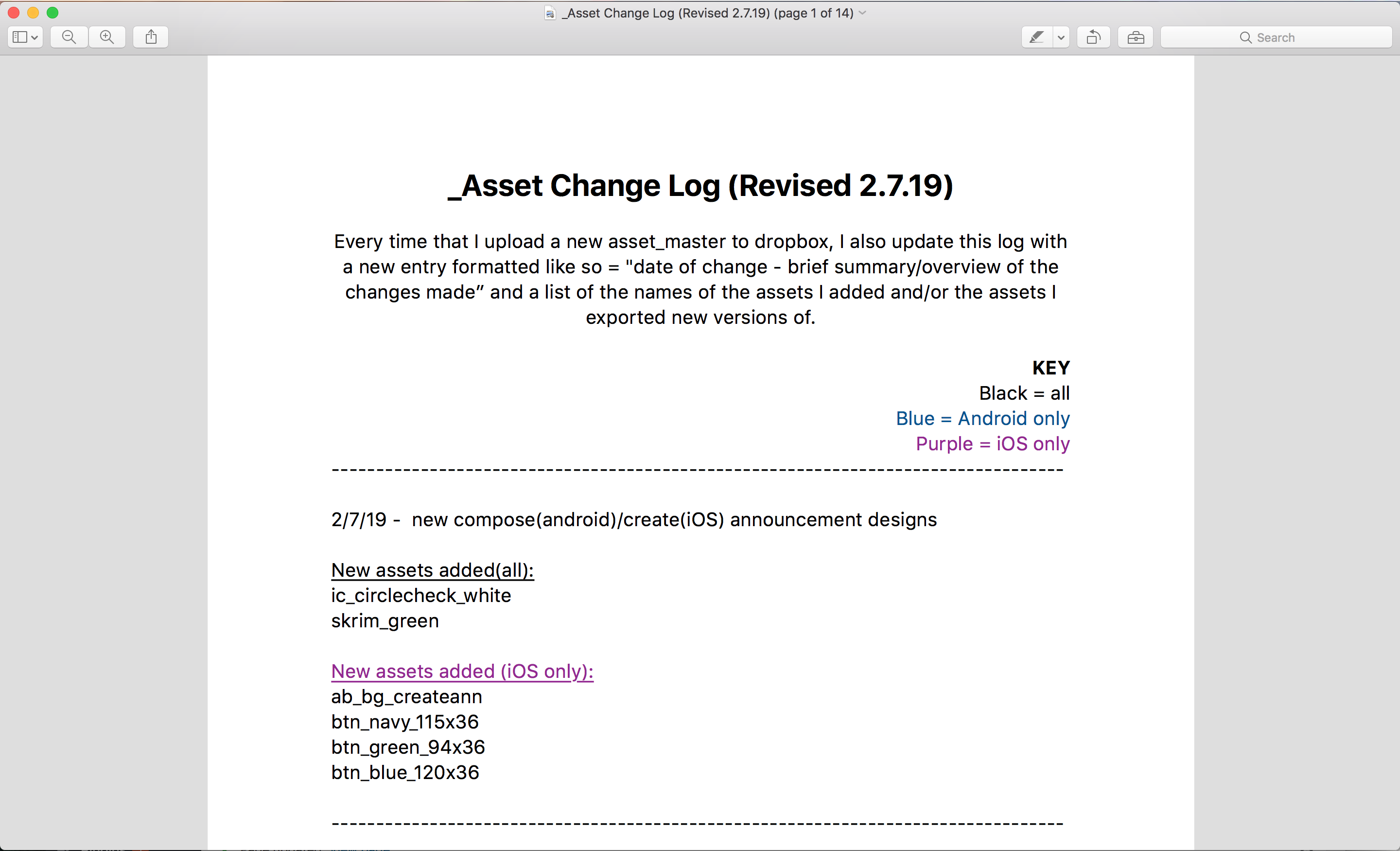
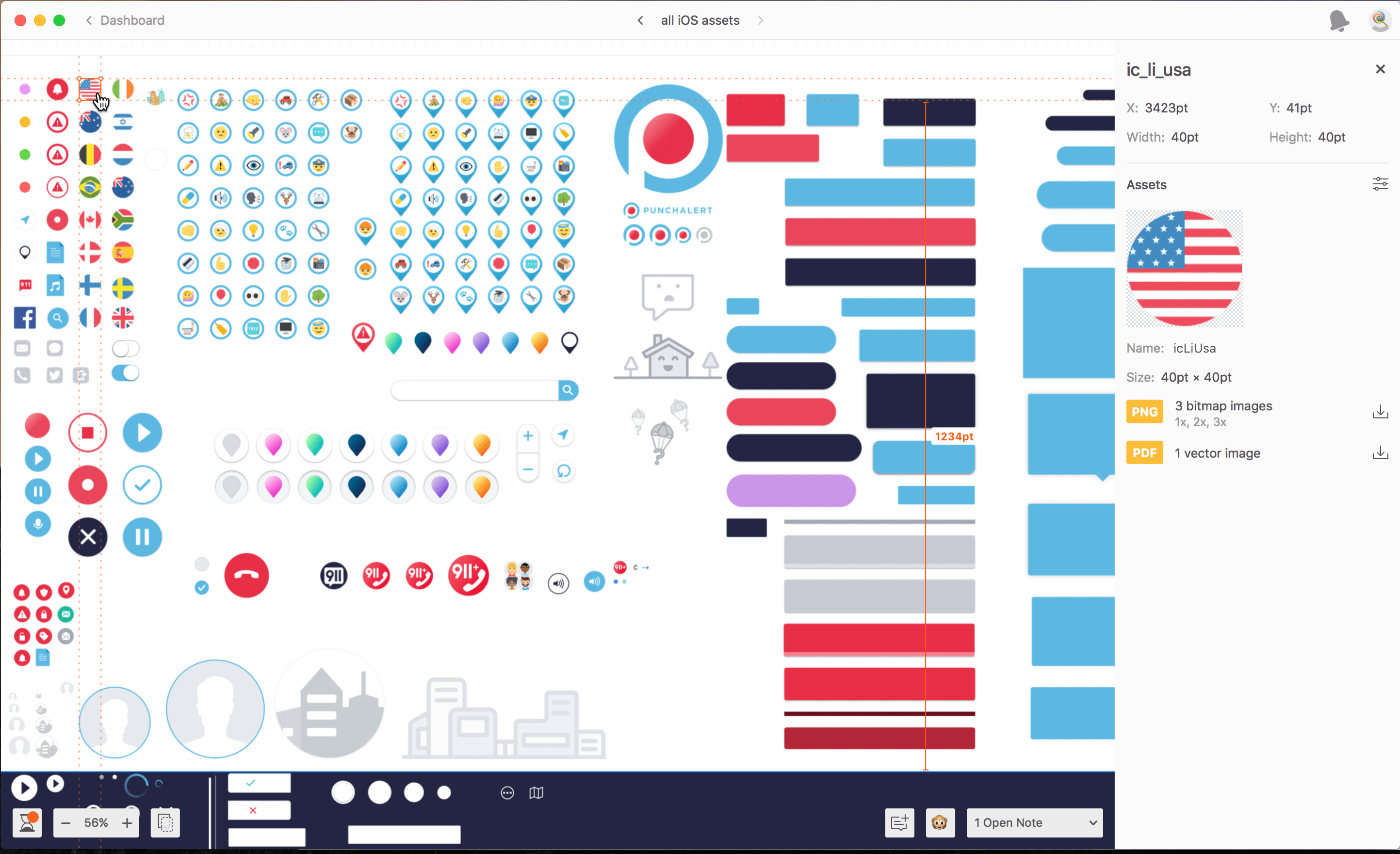
To ensure consistency I created a system for naming assets with a focus on keeping file names short (see “Asset Naming Guide” shown below). Alongside this naming system I also created a Asset Change Log where I would list all the new assets I added, when I added them, if they were added to both iOS and Android, only iOS or only android, and a brief summary of the changes I made to the designs that those assets were incorporated in. Lastly I uploaded the assets sketch file to zeplin so if the developers ever forgot the name of an asset and couldn’t find it searching through the asset folder or after using the asset naming guide, then they could open zeplin and click on the asset they needed to know the name of.
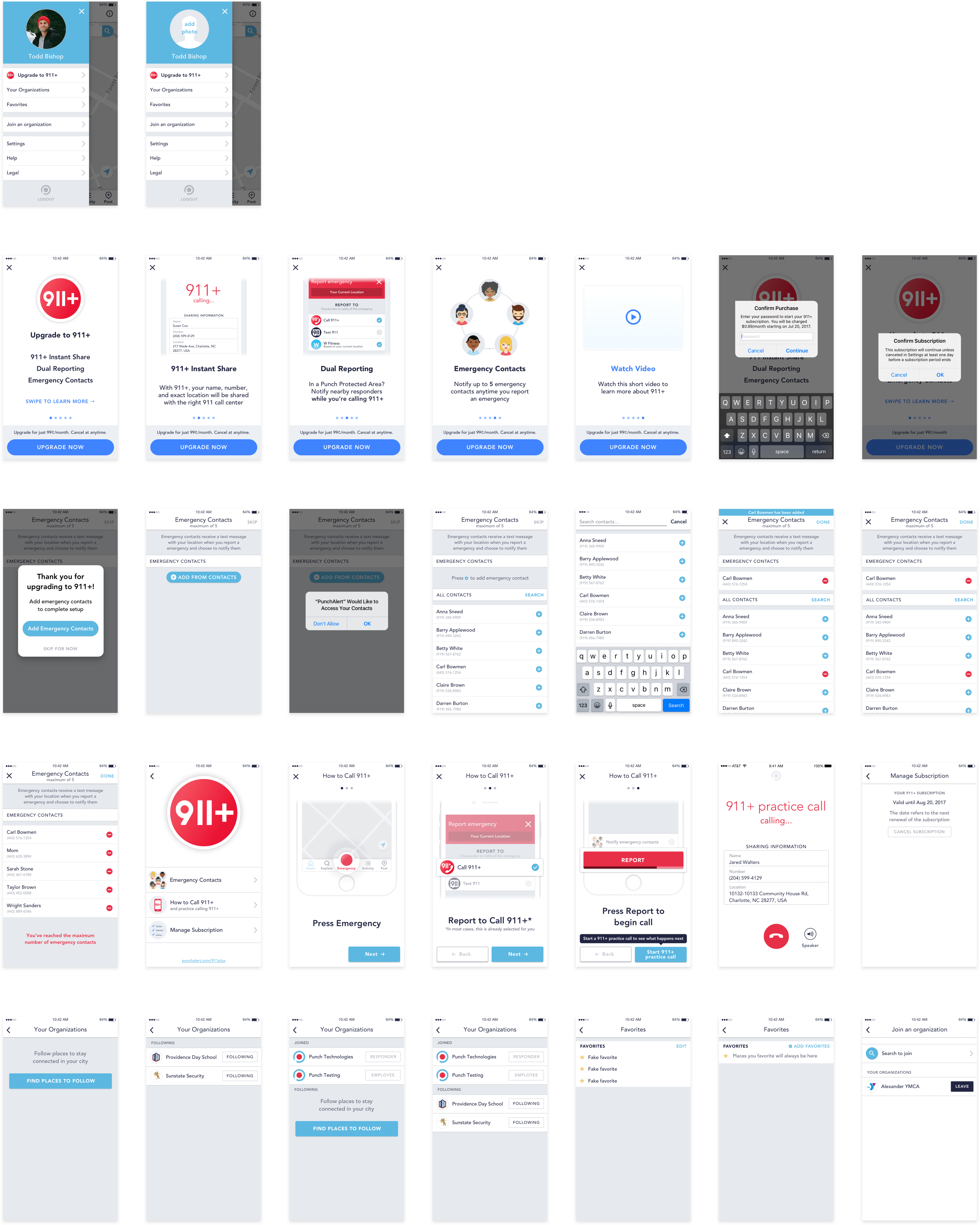
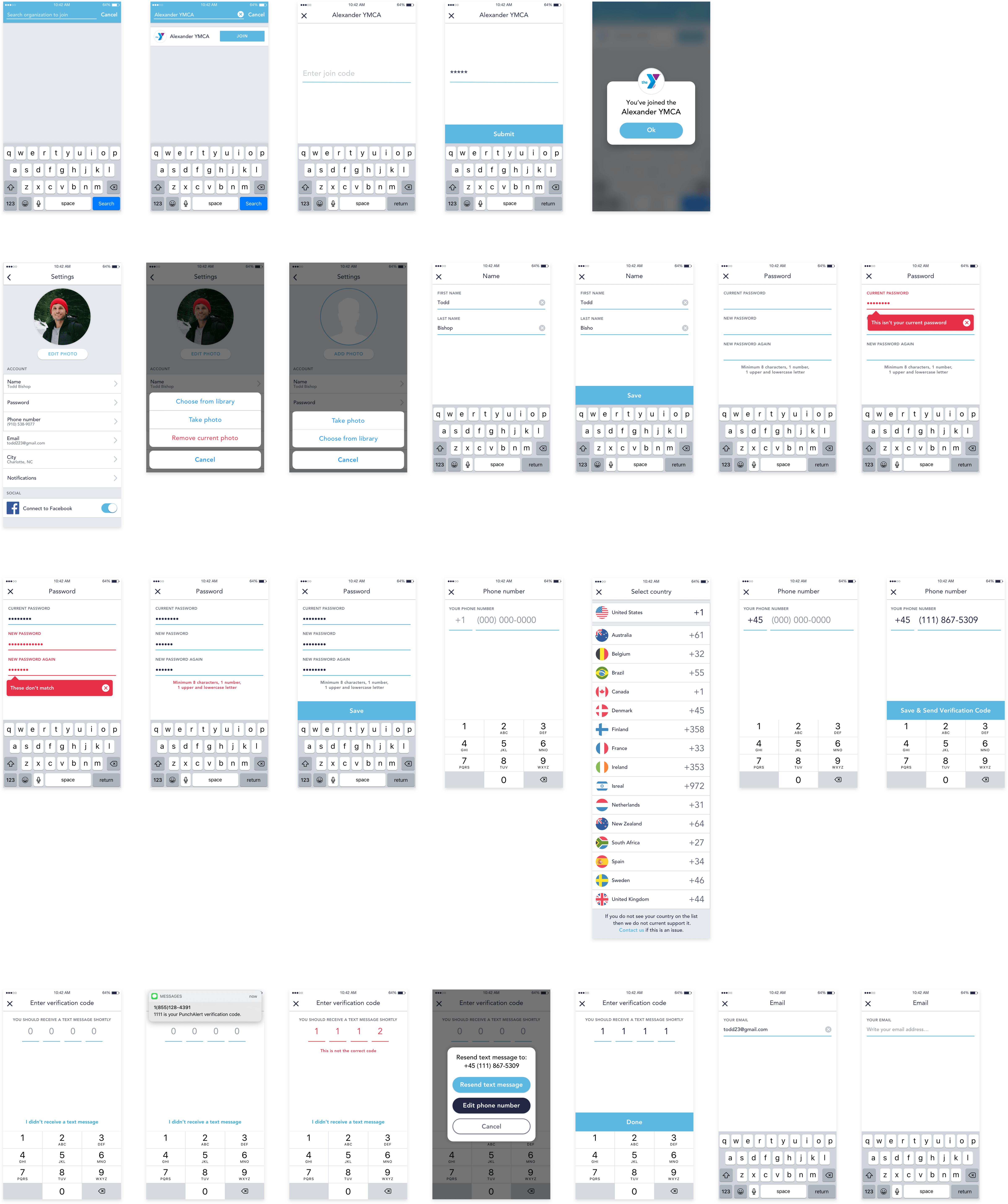
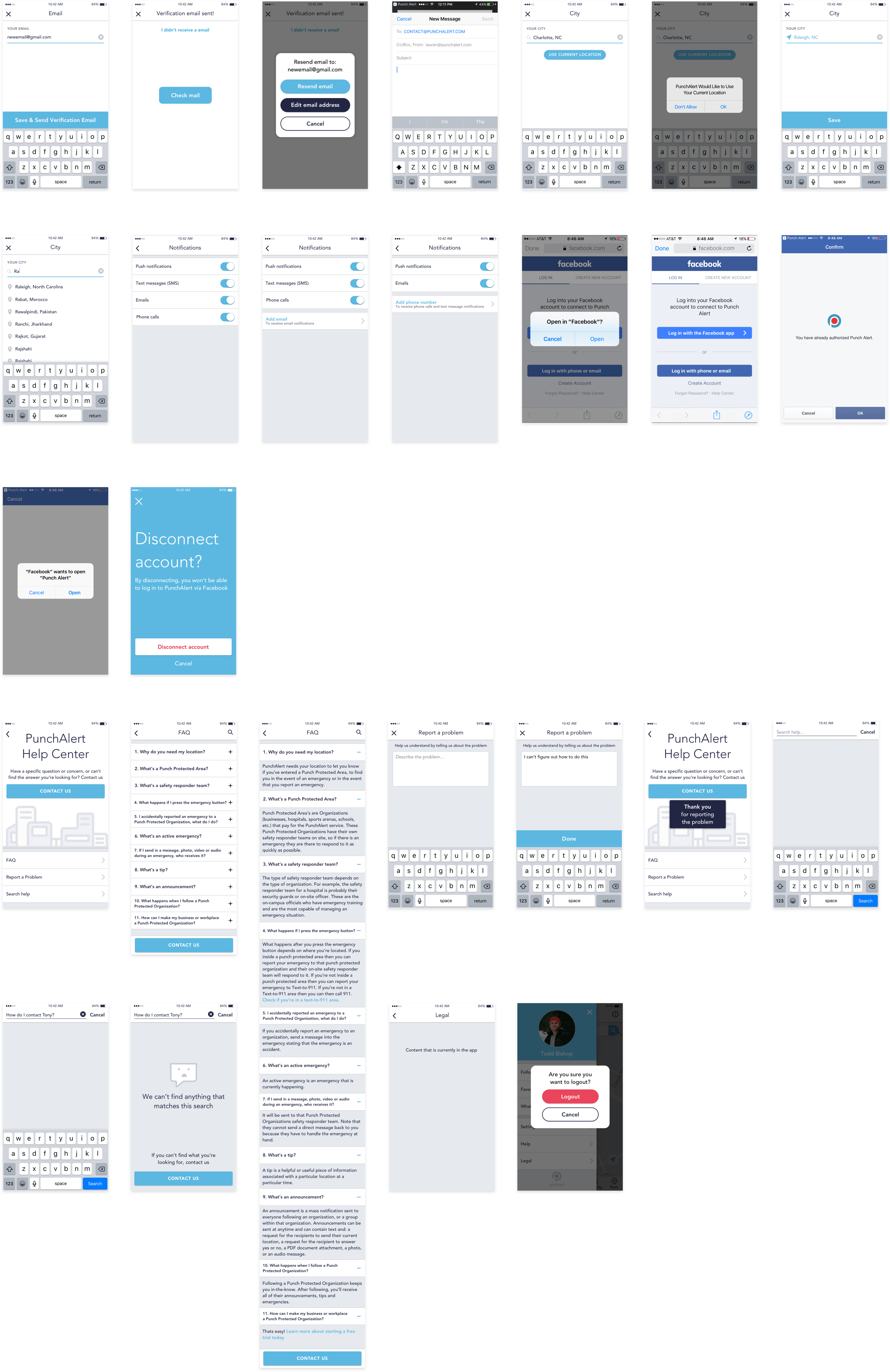
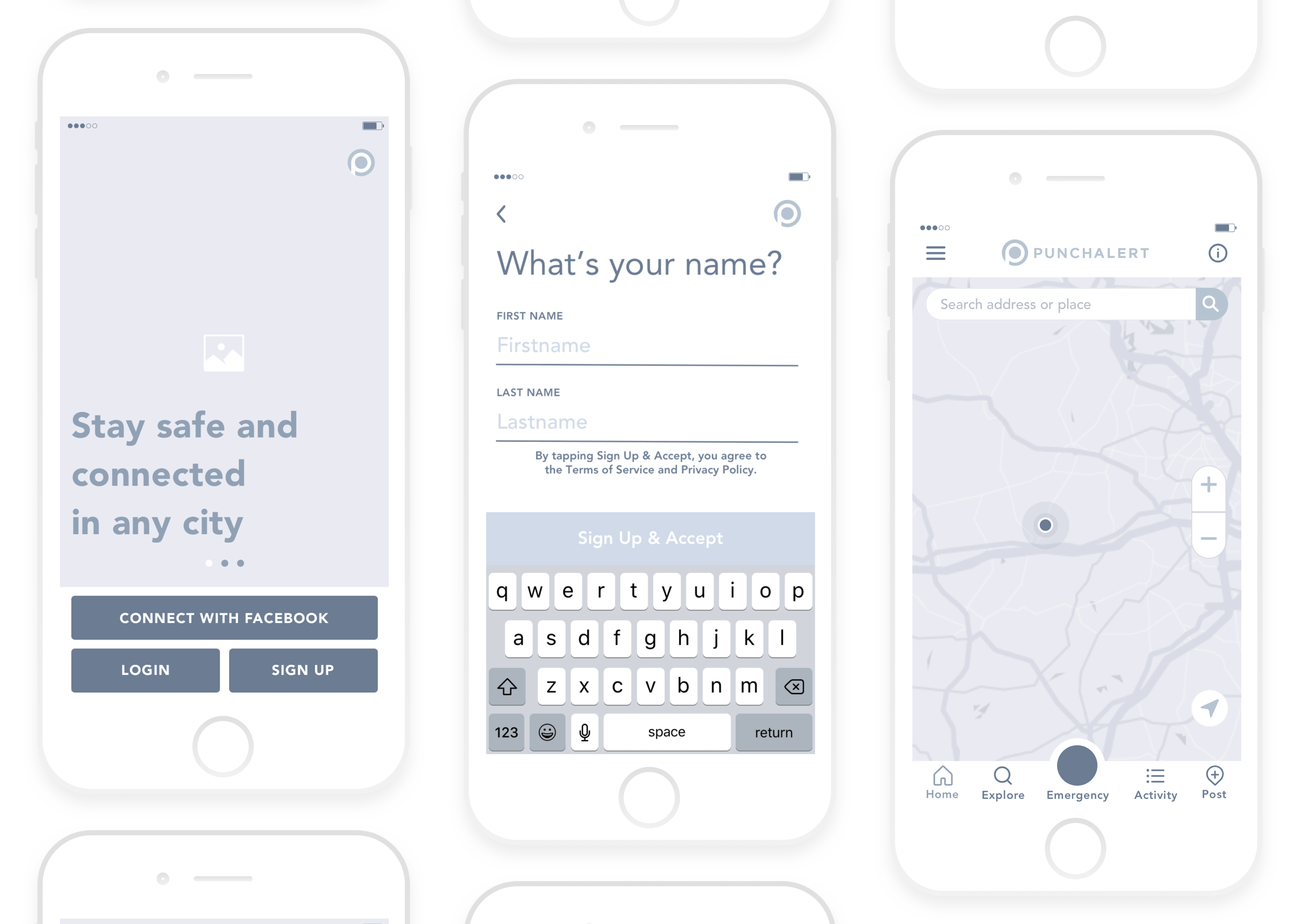
First Time Use
Sign up
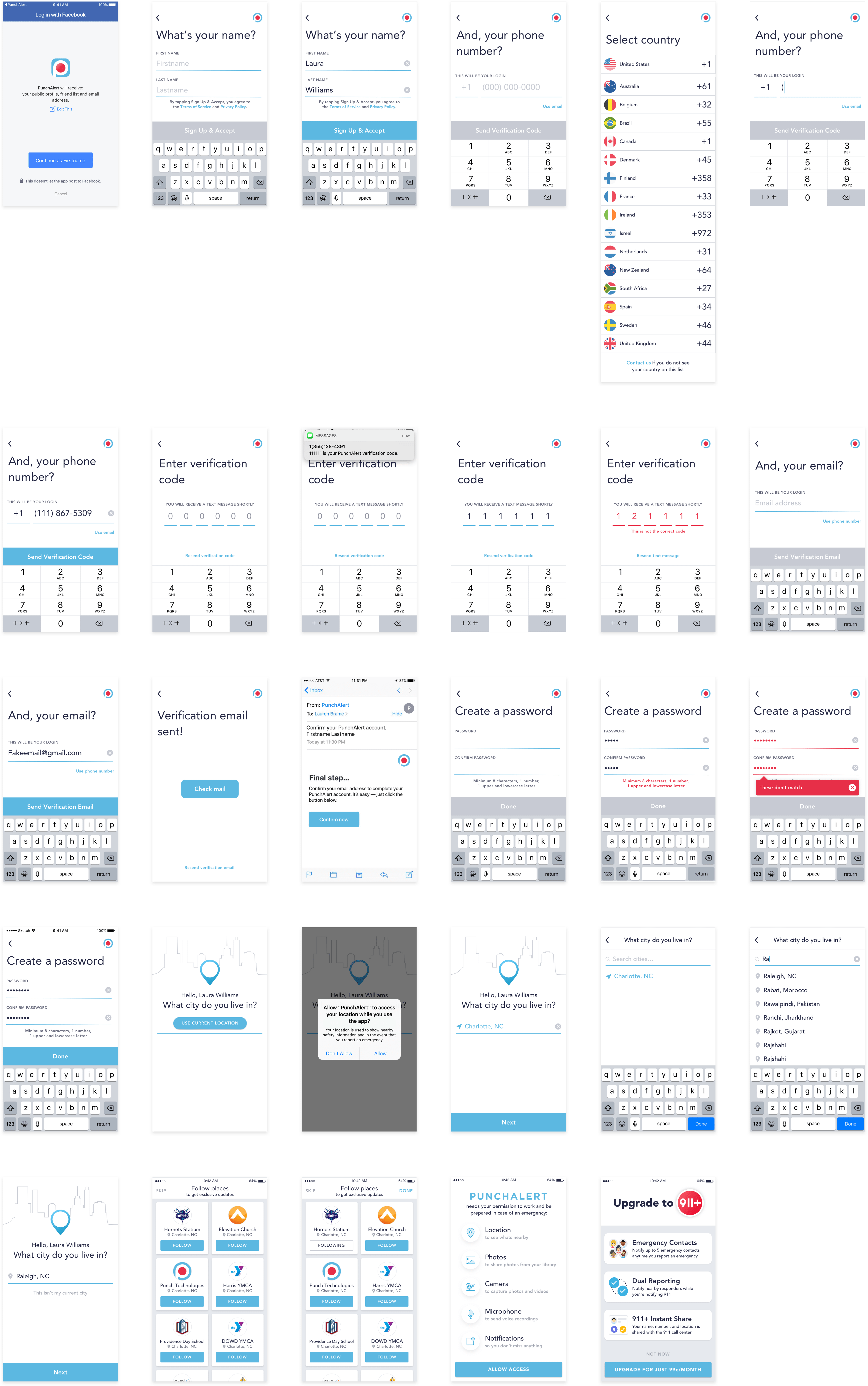
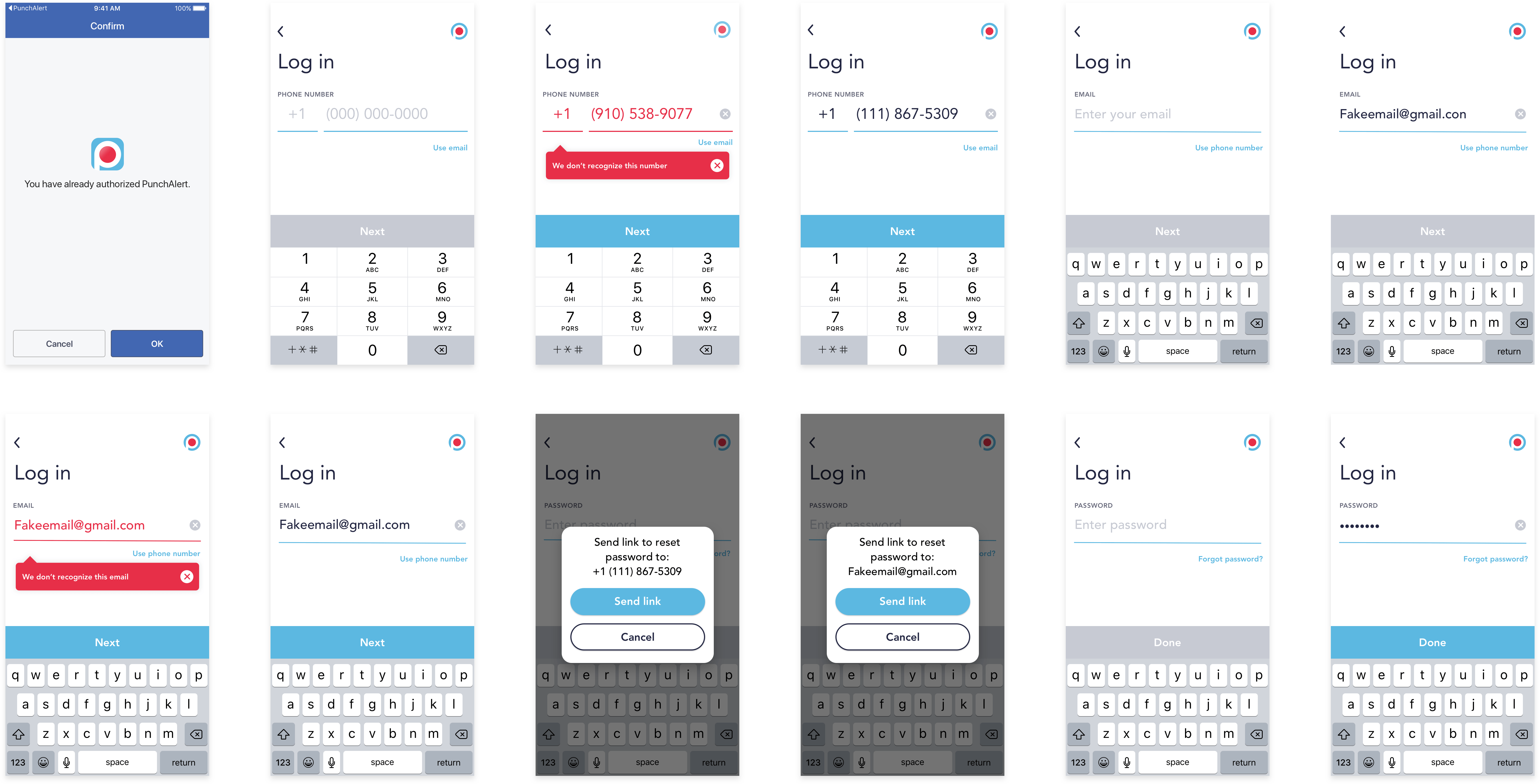
Login
Home, search & favorites
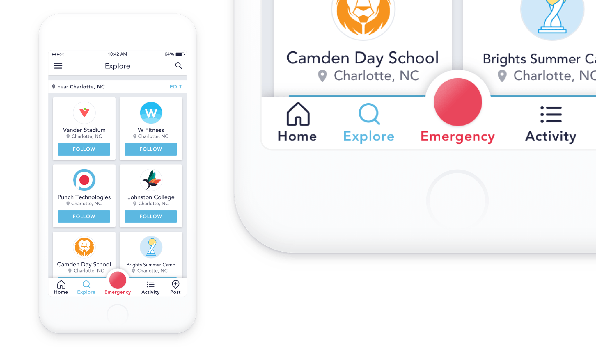
Explore & Organizations Page
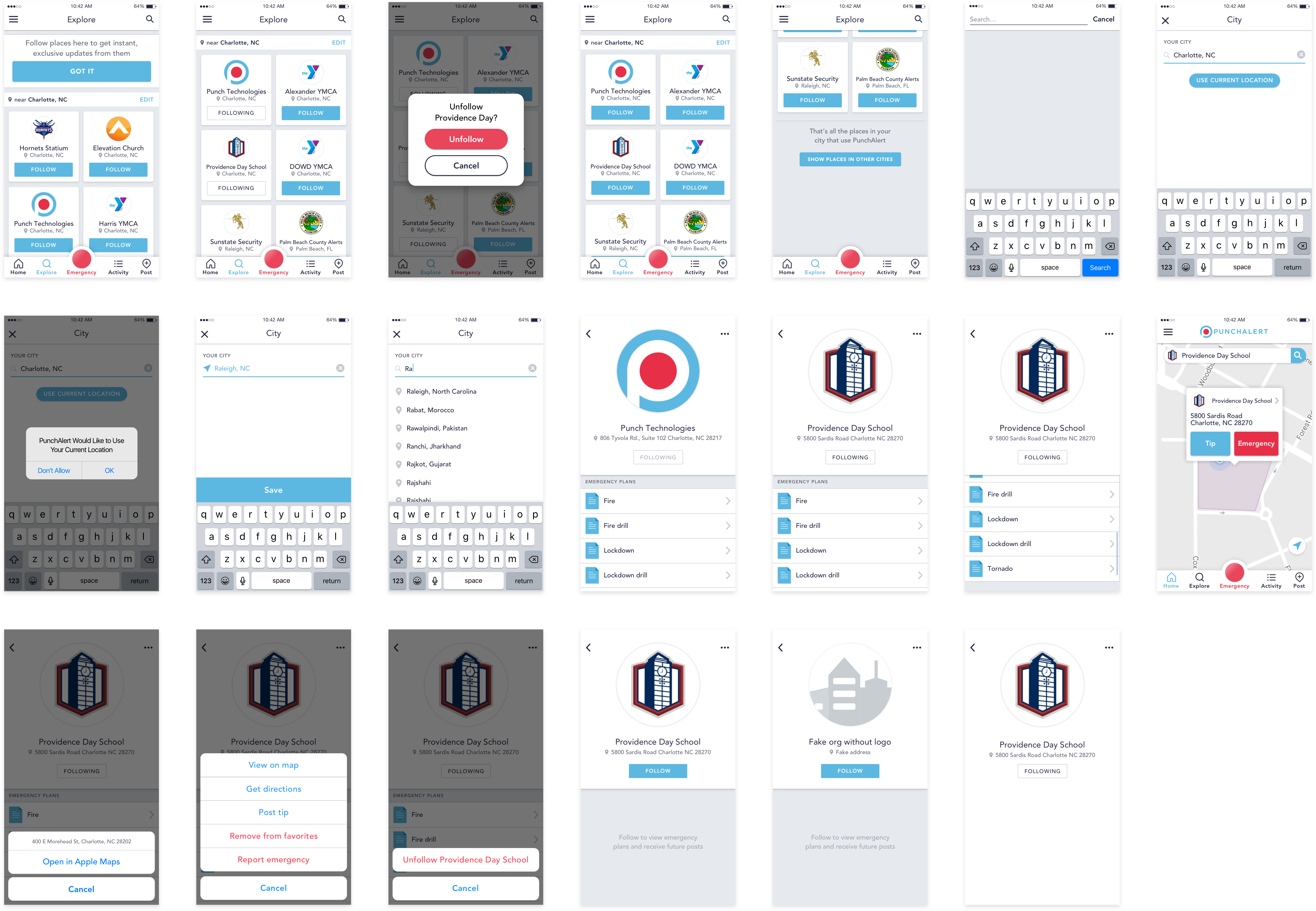
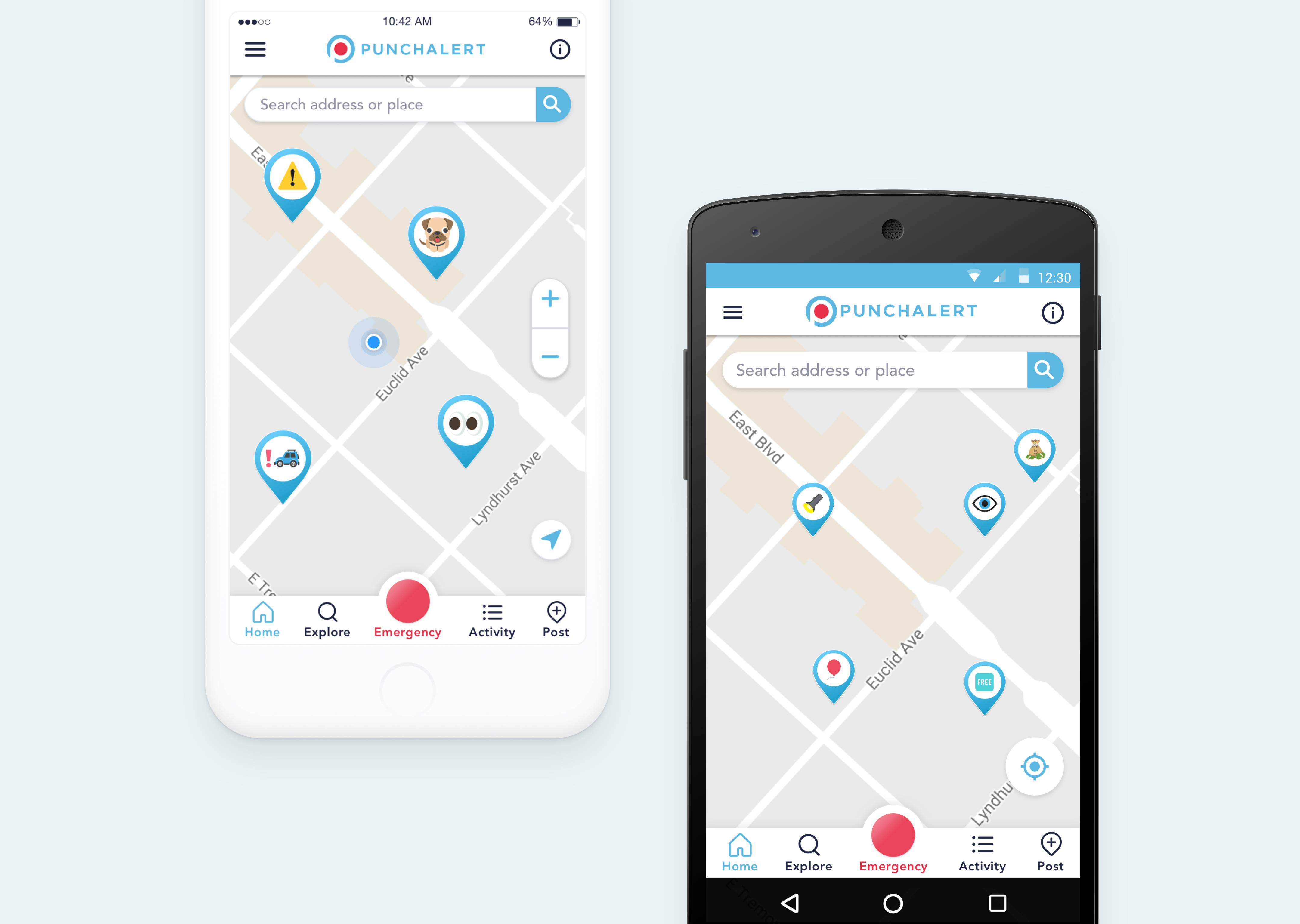
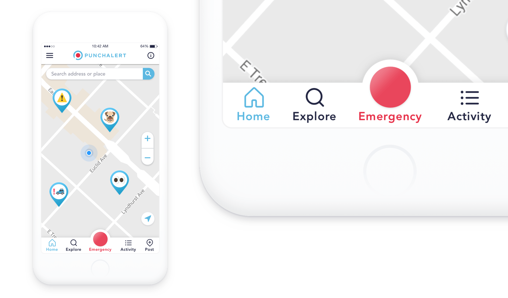
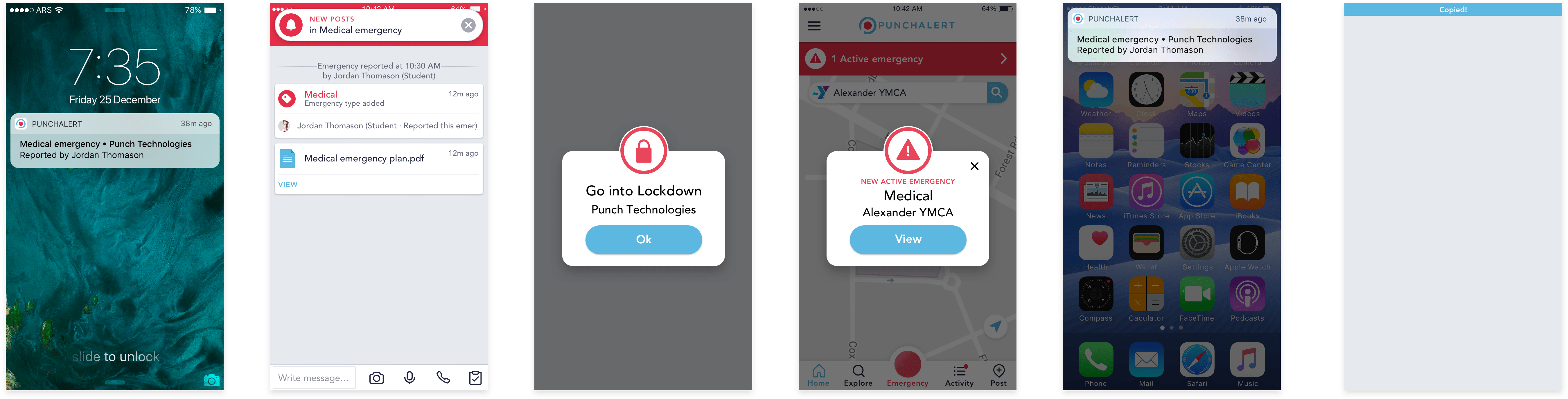
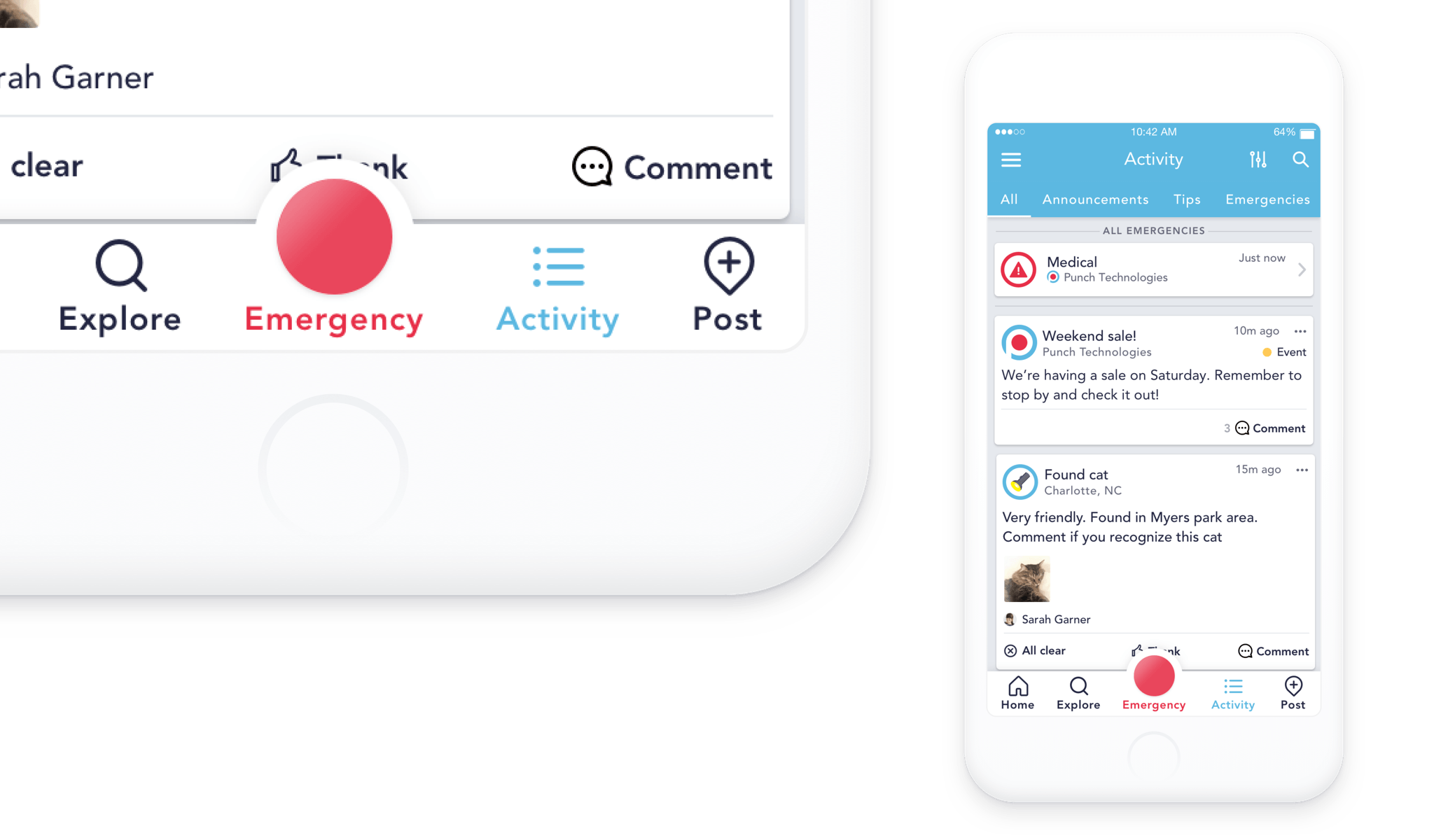
Emergencies
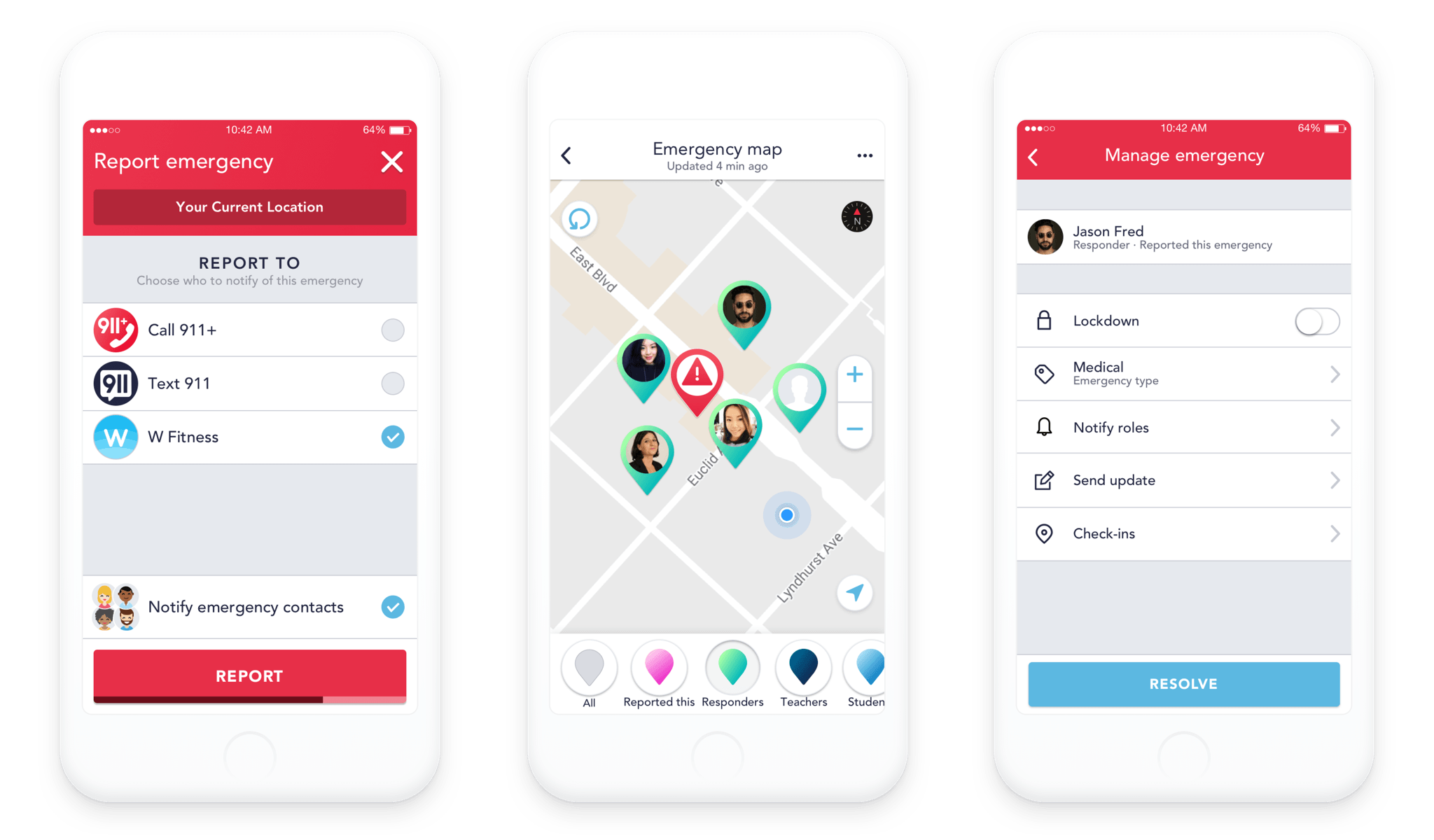
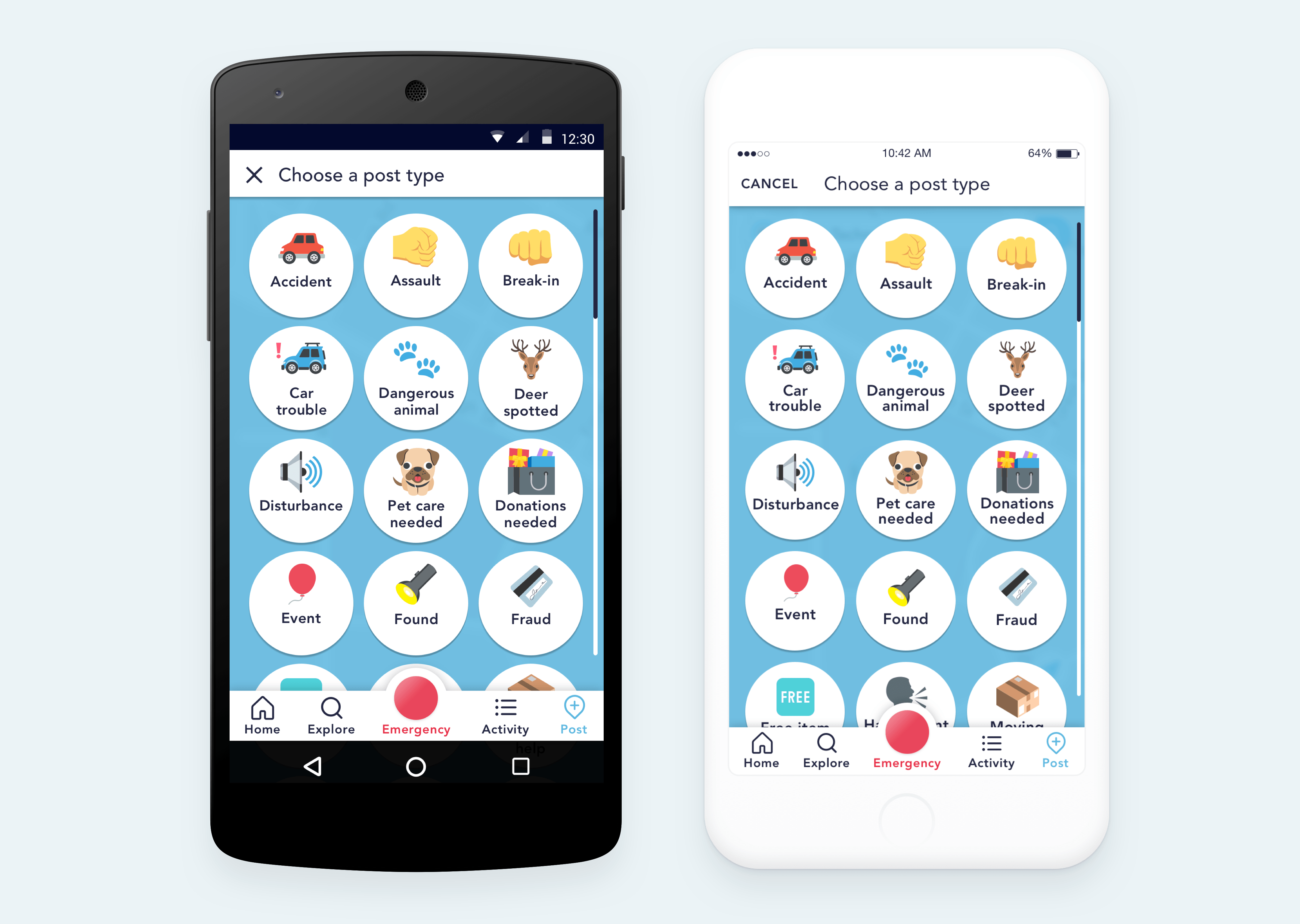
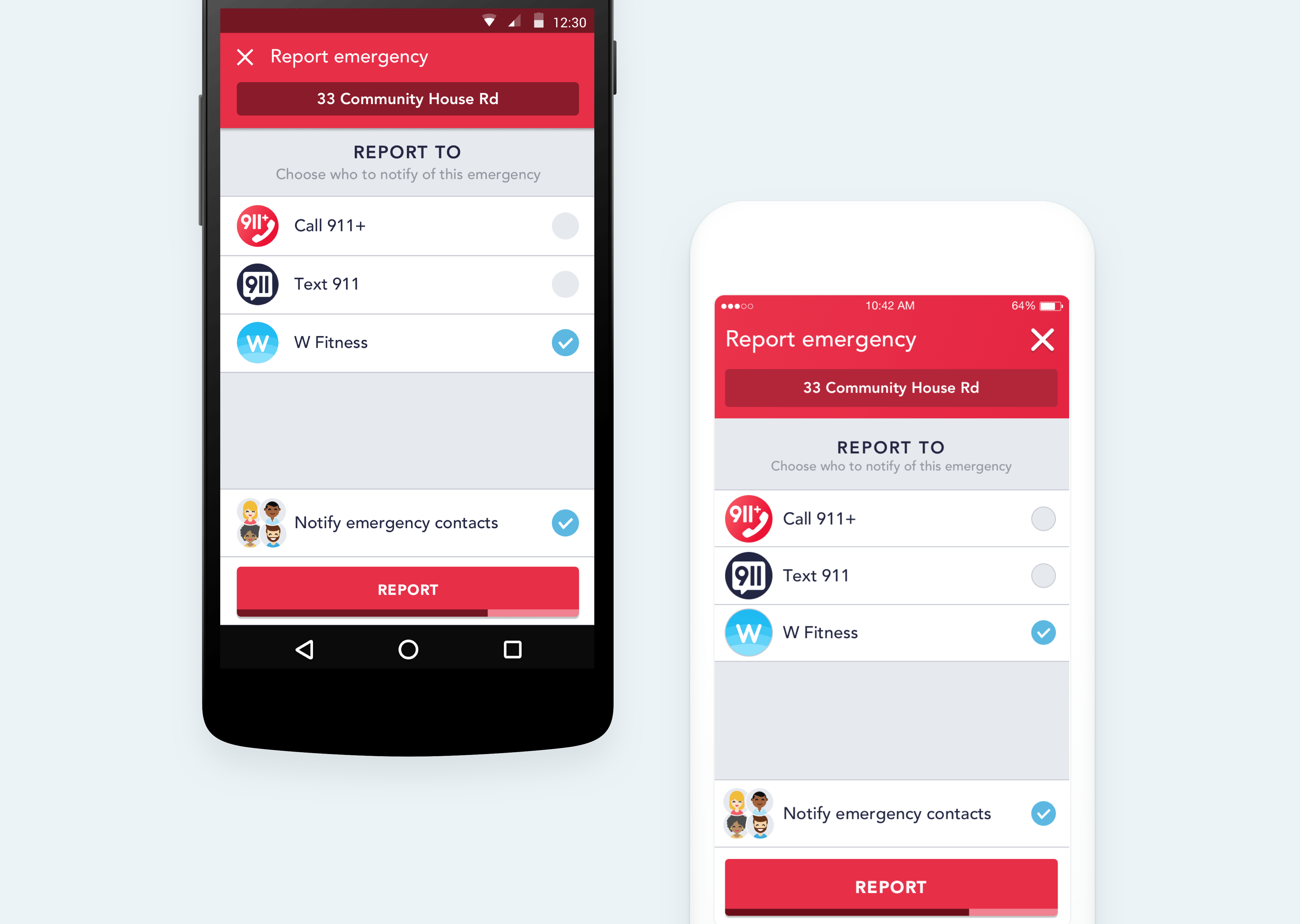
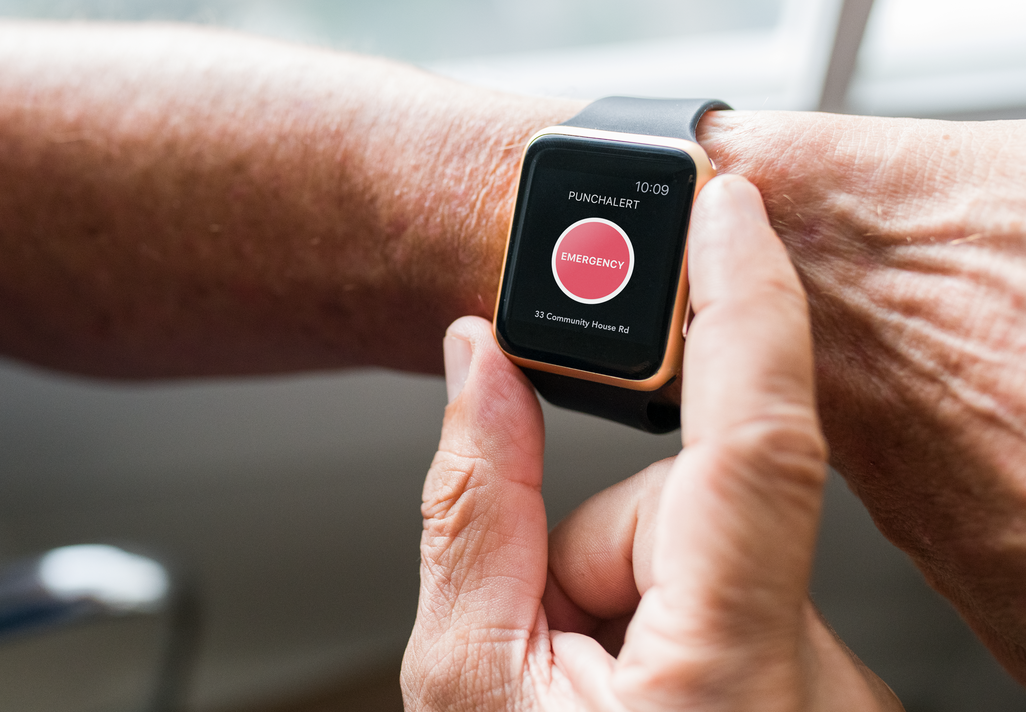
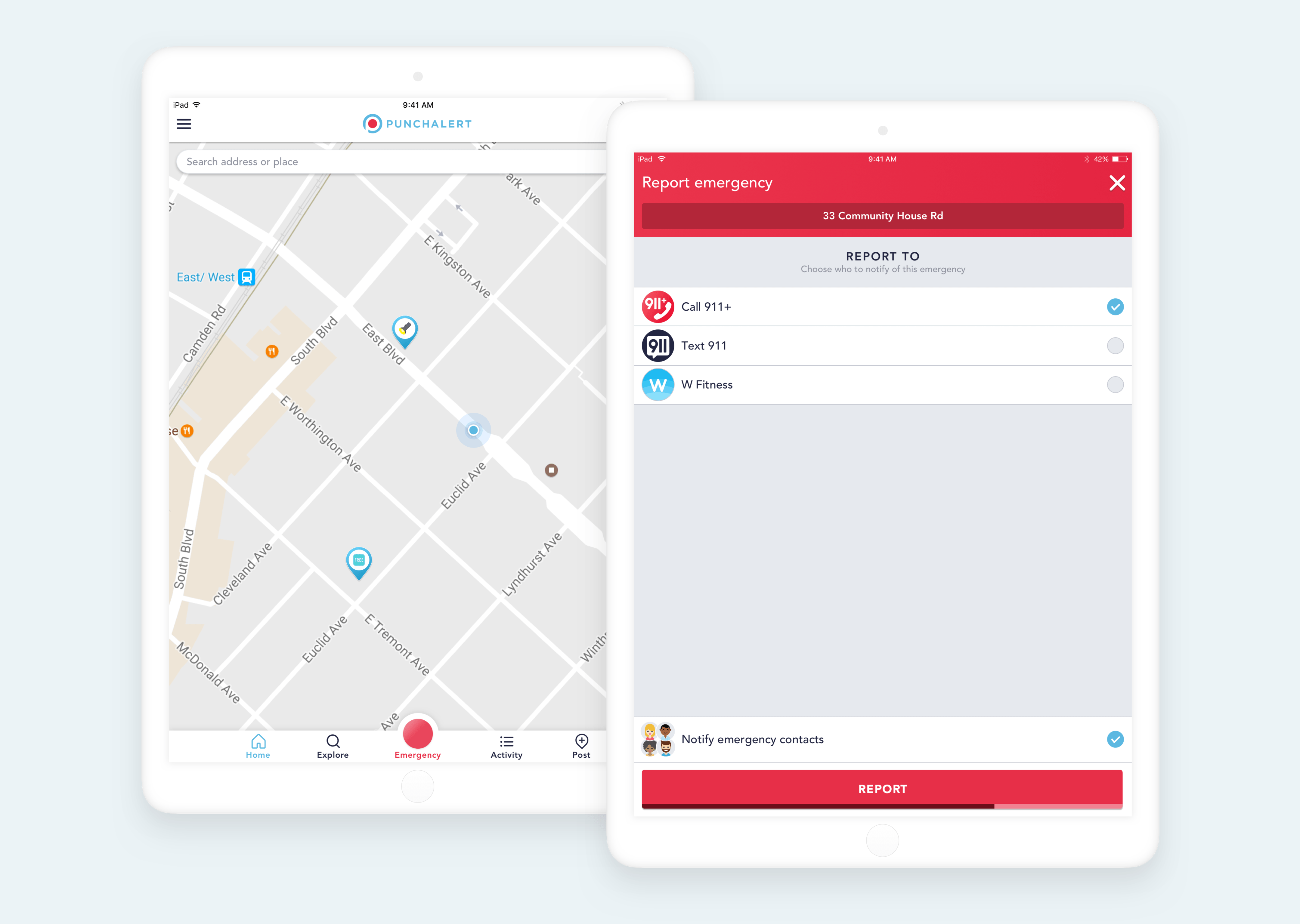
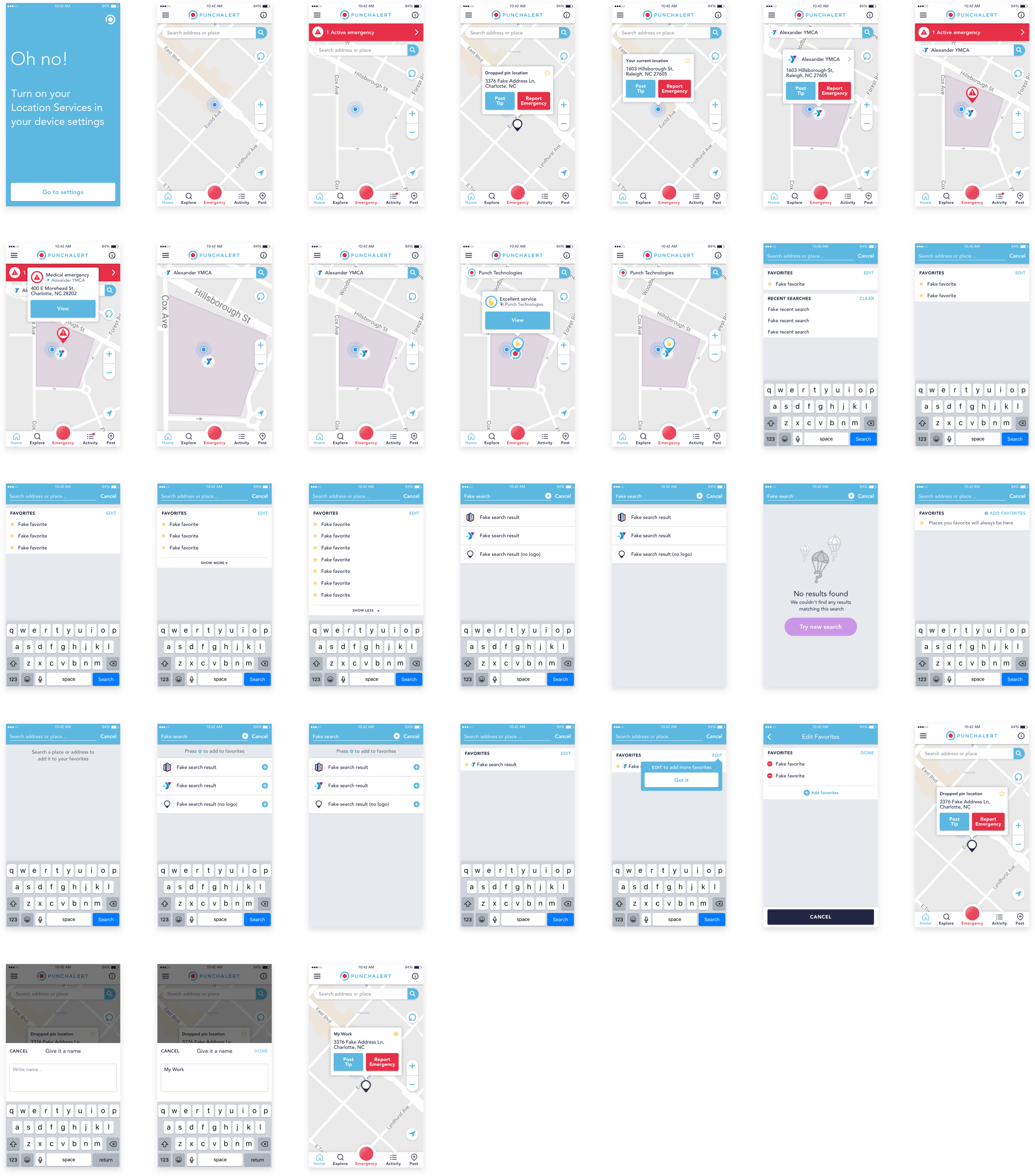
reporting an emergency
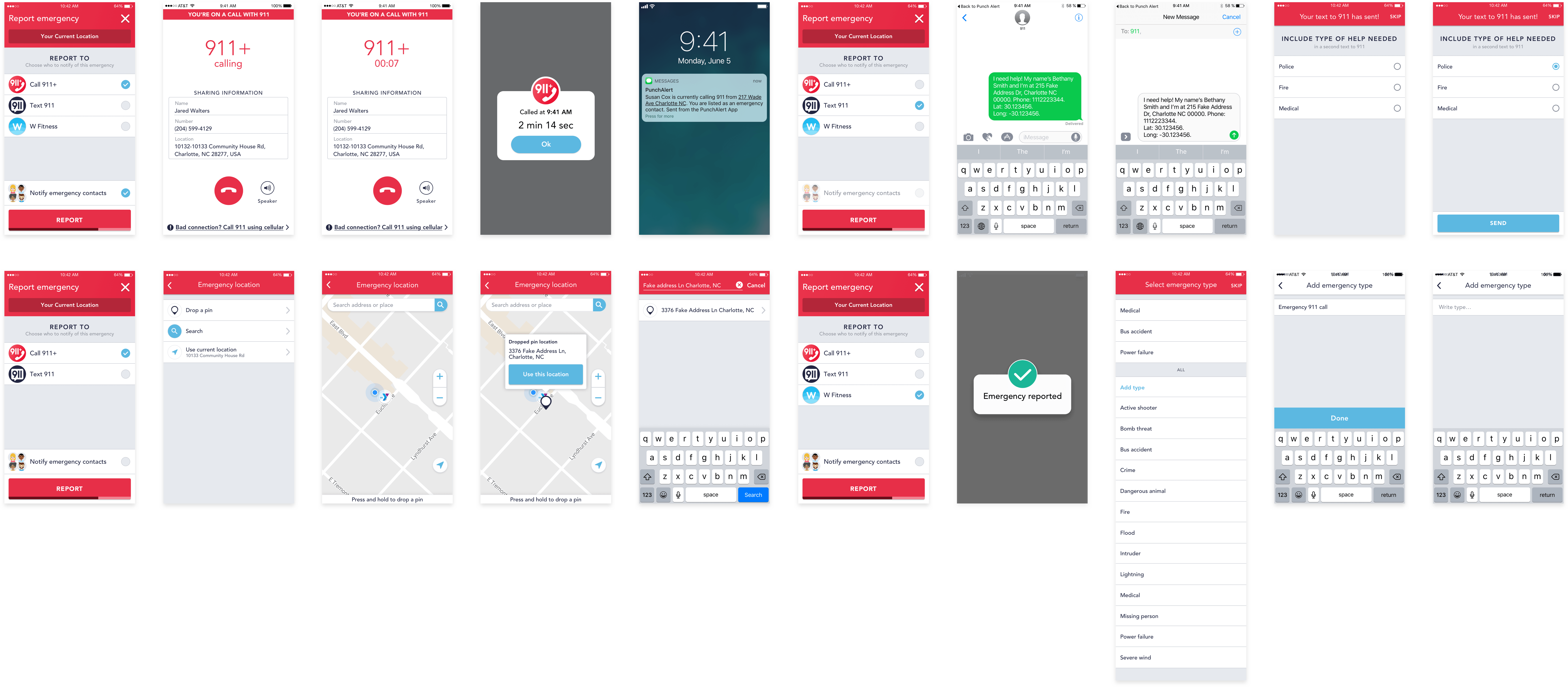
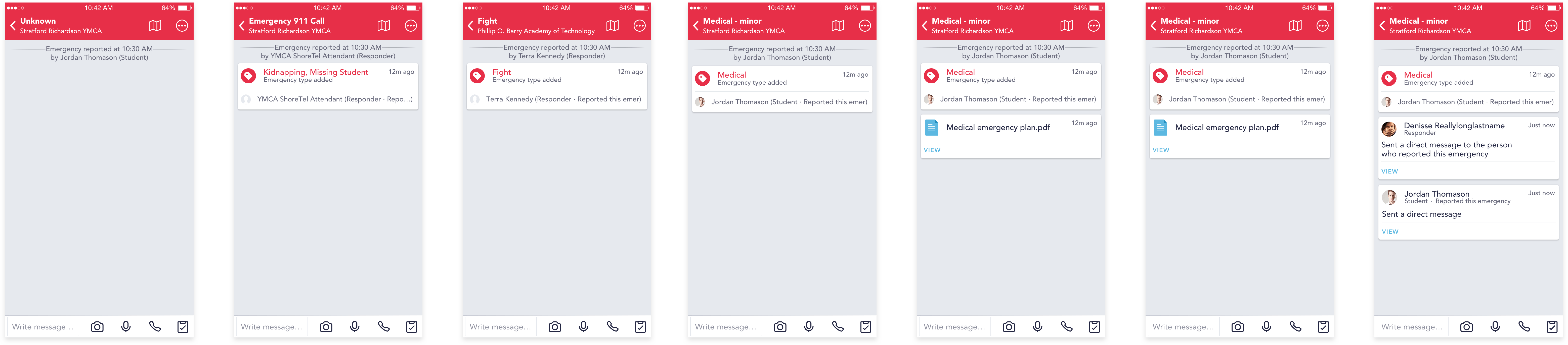
active emergency
posts
notifications
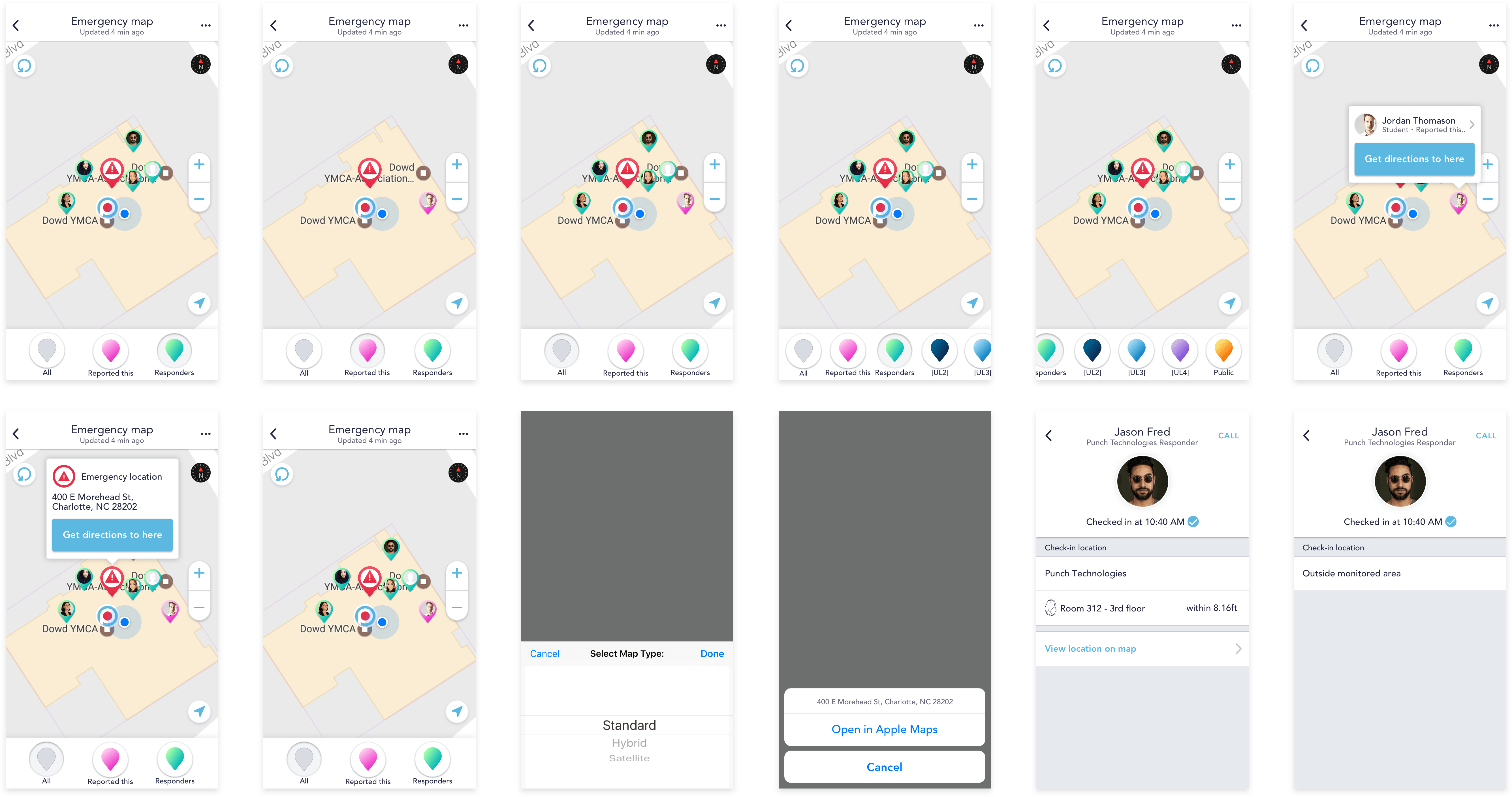
map & profile
keyboard
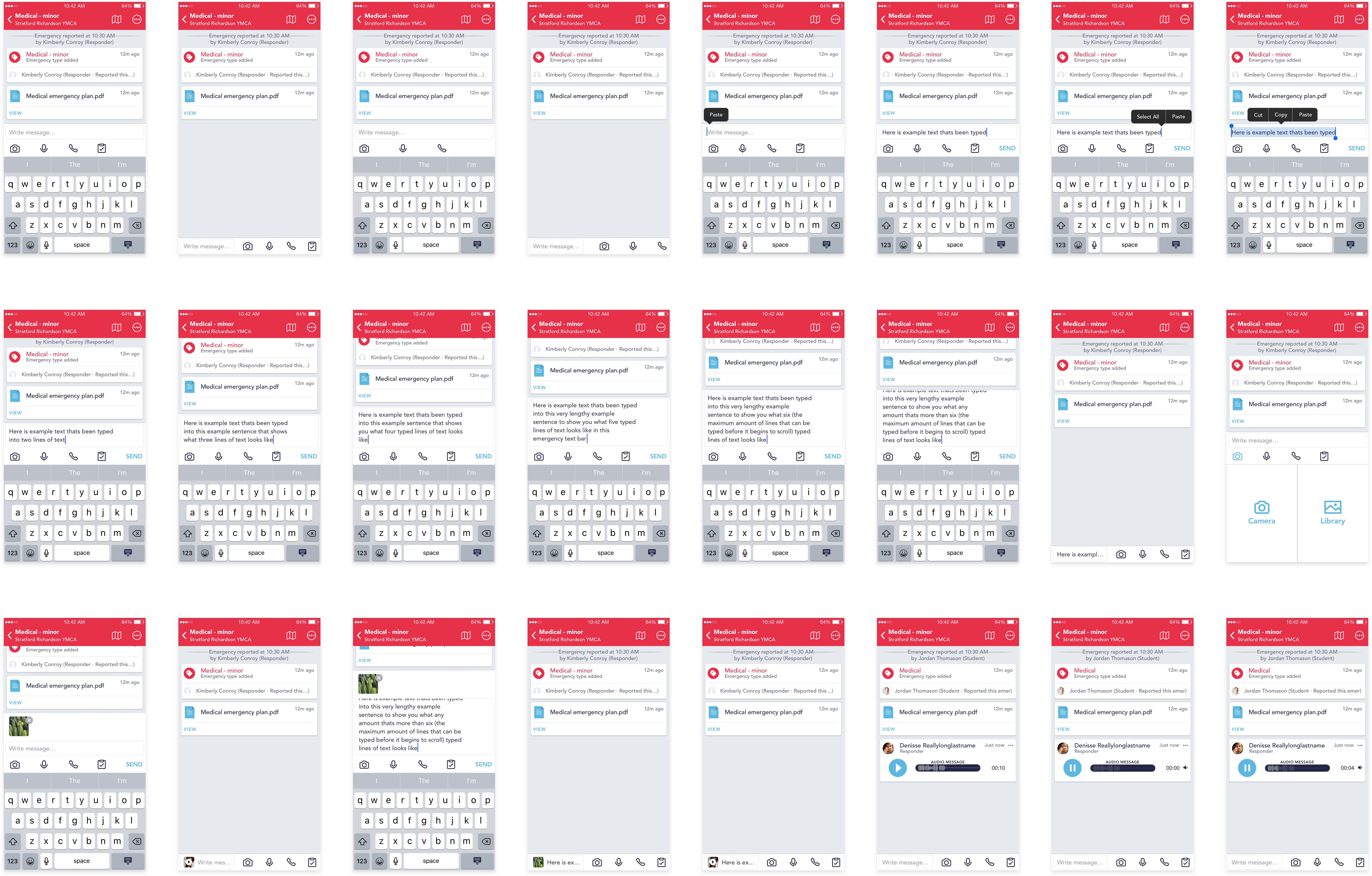
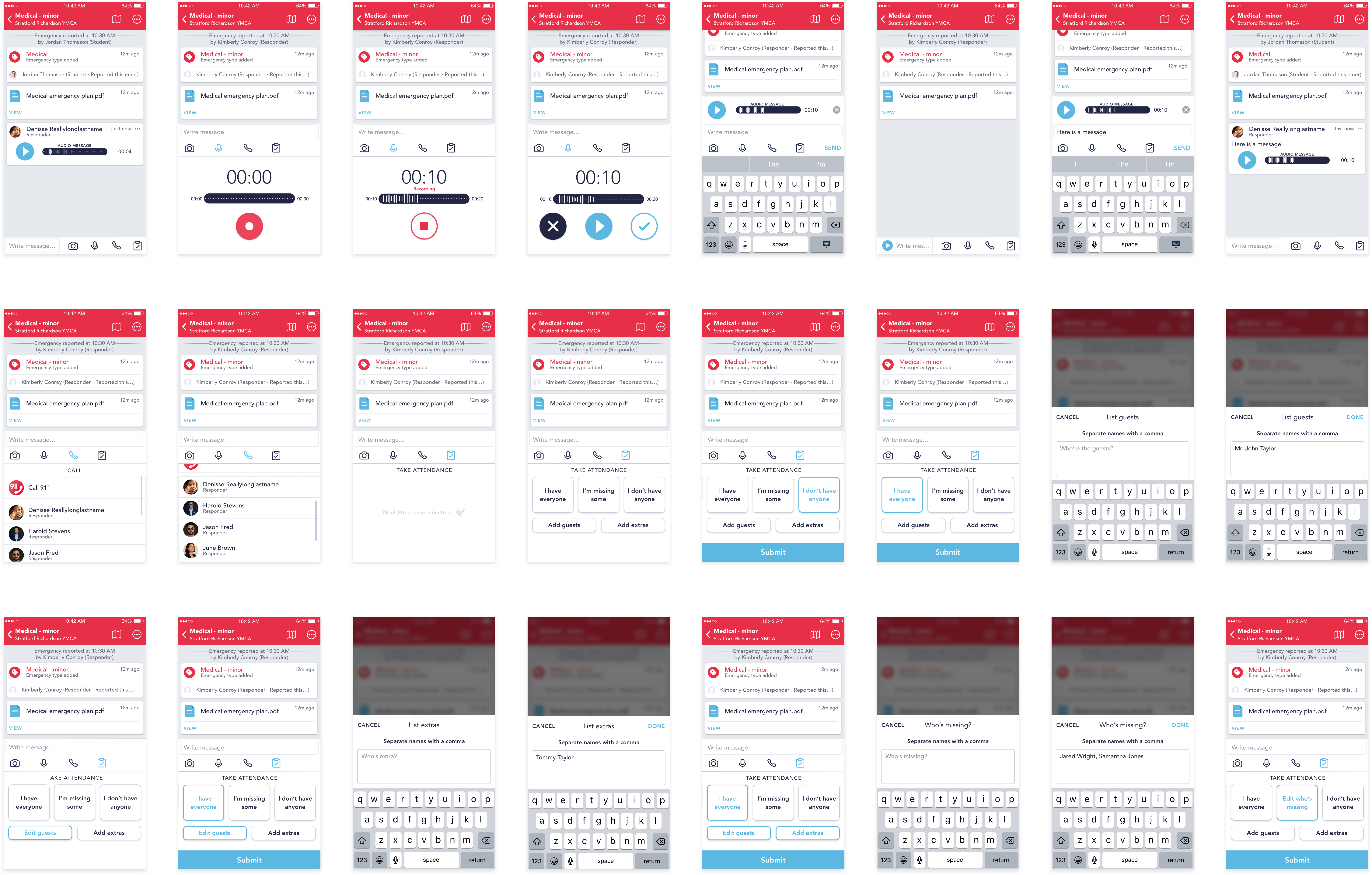
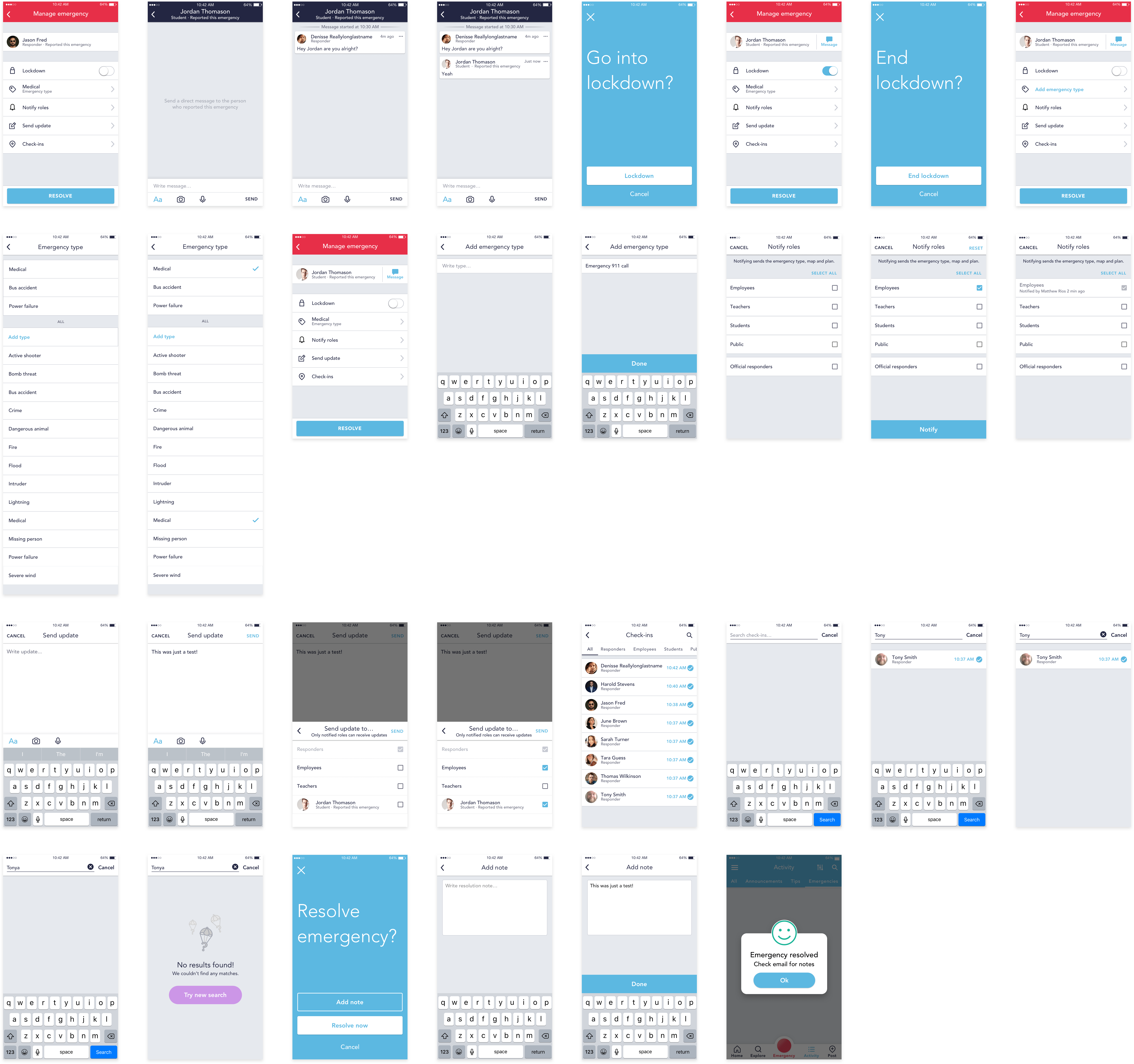
manage emergency
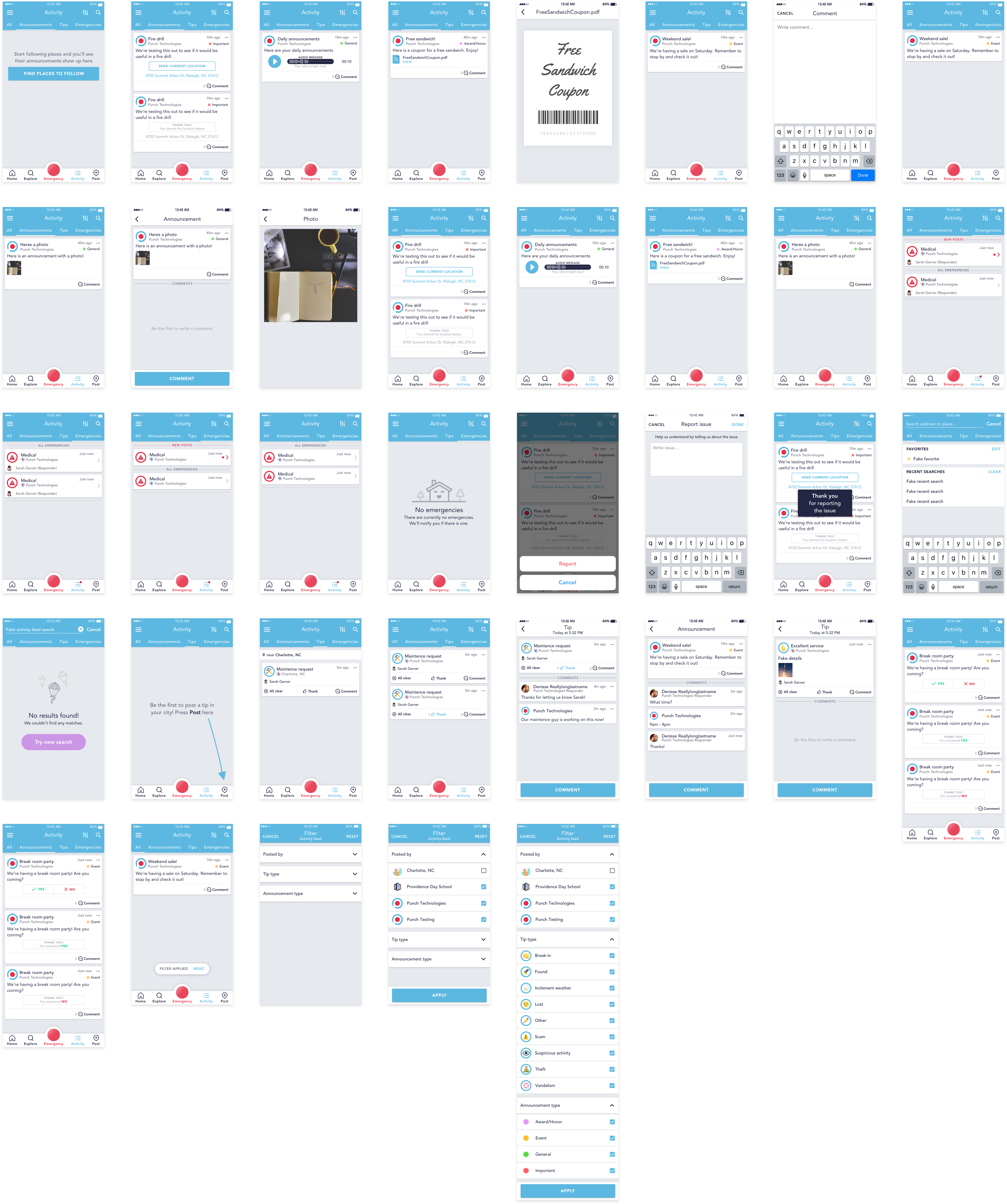
Activity
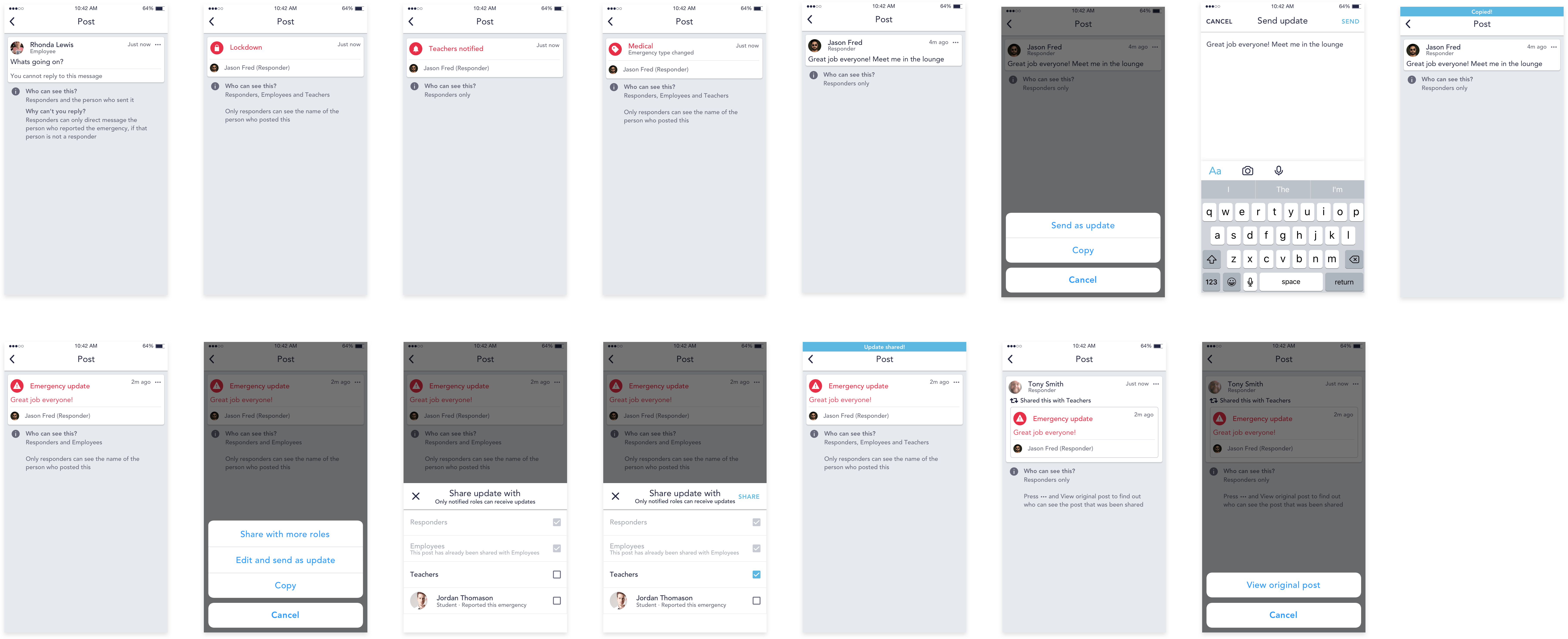
Post
Tips
Create announcement
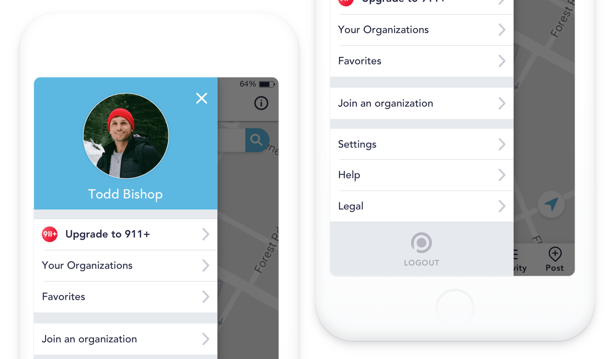
Menu & Settings